
Time Series and Logistic Regression with Plotly and Pandas
- The Tech Platform

- Jan 5, 2022
- 9 min read
Updated: Mar 14, 2023
How to visualize area plots and trends lines over grouped time periods with interactive Plotly graph objects.
In Brief: Create time series plots with regression trend lines by leveraging Pandas Groupby(), for-loops, and Plotly Scatter Graph Objects in combination with Plotly Express Trend Lines.
Overview
Data: Counts of things or different groups of things by time.
Objective: Visualize a time series of data, by subgroup, on a daily, monthly, or yearly basis with a trend line.
Issues: Confusion over syntax for Plotly Express and Plotly Graph Objects and combining standard lines charts with regression lines.
Environment: Python, Plotly, and Pandas
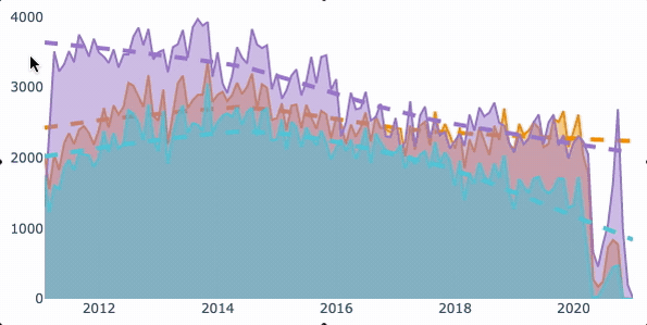
Figure 1 — Is the the graph you are looking for? Generated from Plotly by the Author Justin Chae .
Data
To illustrate how this works, let’s say we have a Pandas DataFrame that has one datetime column and a few other categorical columns. You are interested in an aggregated count of one of the columns (‘types’) over a period of time (‘dates’). The columns could be numeric, categorical, or boolean, it does not matter.
Note: This initial section contains code for context and to show common mistakes, for the good-to-go solution, skip to the bottom of this article. To skip directly to working code, see this GitHub Gist.
# Example Data
data = {'dates':
        ['2012-05-04',
         '2012-05-04',
         '2012-10-08'],
        'types':
        ['a',
         'a',
         'z'],
        'some_col':
        ['n',
         'u',
         'q']
        }

df = pd.DataFrame.from_dict(data)
Group, Organize, and Sort
As a first step, group, organize and sort the data to generate counts by time for the desired metric. In the following code block, there are a few line-by-line transformations that you might take during this phase.
# some housekeeping
df['dates'] = pd.to_datetime(df['dates'])

# subset
df = df[['dates', 'types']]

# groupby and aggregate
df = df.groupby([pd.Grouper(key='dates')]).agg('count')

# reset index
df = df.reset_index()

# rename the types col (optional)
df = df.rename(columns={'types':'count'})
For clarity, these steps can be done any number of ways as shown below with some additional data. The important thing is to group and then count things by datetime, however you want to do that.
data= {
    'dates':
        ['2012-05-04',
        '2012-05-04',
        '2012-06-04',
        '2012-08-08'],
    'types':
        ['a',
        'a',
        'z',
        'z',],
     'some_col':
         [
         'n',
         'u',
         'q',
         '']
     }

 df['dates'] =pd.to_datetime(df['dates'])

 df=df[['dates', 'types']].groupby([pd.Grouper(key='dates')]).agg('count').reset_index()

 df=df.rename(columns={'types:'count'})

 print(df)

 """
     dates  count
     1 2012-06-04      1
     2 2012-08-08      1
     0 2012-05-04      2
 """
If you notice, the preceding code results in groups by the dates provided. But what if you want to group by months or years? To accomplish this task, use Grouper parameters for frequency.
Pandas Grouper Docs
freq='M'
# or 'D' or 'Y'
df=df[['dates', 'types']].groupby([pd.Grouper(key='dates', freq = freq)]).agg('count').reset_index()

"""
    dates  count
2 2012-07-31      0
1 2012-06-30      1
3 2012-08-31      1
0 2012-05-31      2
"""

# group by the category being counted, or count in this case
group=df.groupby('count')
print(group)

"""
<pandas.core.groupby.generic.DataFrameGroupBy object at 0x7fc04f3b9cd0>
"""
In the code block above, when using the Grouper method with monthly ‘M’ frequency, notice how the resulting DataFrame generates monthly rows for the given range of data. Finally, as a last step to DataFrame preparation, group the data by ‘count’ — we will come back to this after working on Plotly.
Plotly Express V. Plotly Graph Objects
Of all the graphing libraries in the land, Plotly is one of the best — it is also one of the most frustrating. On the positive side, Plotly is capable of producing excellent visualizations, allows you to avoid Java (if that’s not your thing), and natively integrates with HTML. On the negative side, the syntax can be quite confusing when switching between single plots and mixed plots. For example, with plotly_express (px) you might pass an entire dataframe as a parameter; however, with graph_objects (go), the inputs change and may require the use of dictionaries and Pandas Series instead of DataFrames.
Of all the graphing libraries in the land, Plotly is one of the best — it is also one of the most frustrating.
A simple plot with Plotly Express
import plotly_express as pxfig = px.area(df, x='dates', y='count')
fig.show()
If all you need is a simple time series, such as the one shown below, then perhaps this is enough. But what about Plotly with two or more counts of data along the same x-axis (time)?
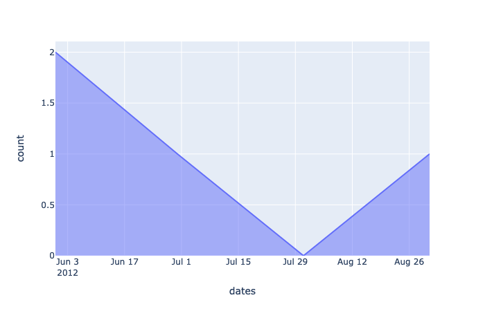
Figure 2 — A simple plot from Plotly Express. Generated from Plotly by the Author Justin Chae .
Switch from Plotly Express to Plotly Graph Objects
I noticed that most of the time, I end up switching to Plotly’s graph_objects library to take advantage of a number of features that are not available in the express version. For example, with graph_objects, I can generate mixed subplots and importantly, overlay multiple types of data (such as time series).
How?
Before, with px, we assigned the px object to fig (the same one as shown in Figure 2) and then displayed fig with fig.show(). Now, instead of creating a single figure comprising one series of data, we want to create a blank canvas that we can later add to. If you run the following code, you will literally return a blank canvas.
import plotly.graph_objects as gofig = go.Figure()With a blank graph_objects in play, you can add traces (graphs) to the canvas. For most common tasks such as lines and scatter plots, the go.Scatter() method is what you want to go with.
# add a graph to the canvas as a trace
fig.add_trace(go.Scatter(x=df['dates'], y=df['count']))
Although this works, you might discover that the output is not ideal. Instead of dots connected by lines in chronological order, we have some sort of strange ‘z’ symbol.
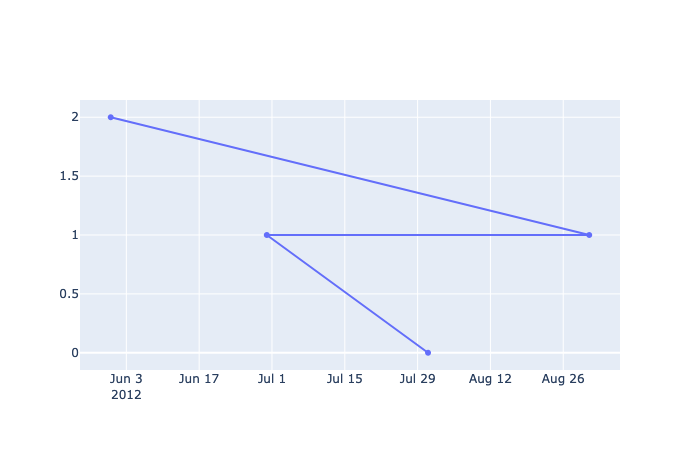
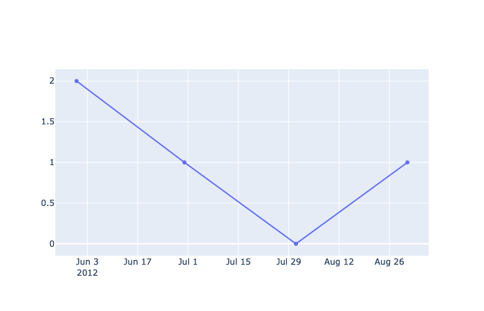
(Left) Figure 3 — A working go.Scatter() plot but not what’s expected. Points are connected in the wrong order. (Right) Figure 4 — The same data after sorting the values by date. Generated from Plotly by the Author Justin Chae .
This small issue can be frustrating at first because with px, the graph works the way you expect without any tweaking but it’s not the case with go. To resolve, just make sure to sort the array by date so that it draws and connects points in some logical order.
# sort the df by a date col, then show fig
df = df.sort_values(by='dates')
At this point, it may be sufficient to manually plot different types of data on the same time series. For instance, if you have two different DataFrames with time series data or multiple subsets, then you could just keep adding traces to the graph_object.
# if multiple DataFrames: df1 and df2fig.add_trace(go.Scatter(x=df1['dates'], y=df1['count']))
fig.add_trace(go.Scatter(x=df2['dates'], y=df2['count']))
# ... and so on
However, if you have a ton of data, writing the same line of code becomes undesirable quickly. For this reason, it helps to group the DataFrame by the types column, then loop through the grouped objects to create all the traces you need.
df = df.groupby('types')# after grouping, add traces with loops
for group_name, df in group:
    fig.add_trace(
        go.Scatter(
              x=df['dates']
            , y=df['count']
        ))
Put it All Together
In the preceding sections, we stepped through some of the parts and pieces required to put the whole entire visualization together, but there are some missing items. For instance, with the groupby methods, we lost the type column of categories (a, b) and it is hard to tell if there is any kind of trend at all with just three data points. For this section, let’s switch to a sample dataset with a couple hundred records and two categories (a, b) that span a few years.
Sample CSV via GitHub Here
Grouper Method Reference Here
Read and Group Data
In the next code block below, a sample CSV table is loaded into a Pandas DataFrame with columns as types and dates. Similarly, as before, we transform the dates column to datetime. This time, notice how we include the types column within the groupby method and then specify types as the column to count.
Group a data frame with aggregated counts by categories in a column.
gitcsv = 'https://raw.githubusercontent.com/justinhchae/medium/main/sample.csv'
df = pd.read_csv(gitcsv, index_col = 0)

df['dates'] = pd.to_datetime(df['dates'])

freq = 'M'

df = df.groupby(['types', pd.Grouper(key='dates', freq=freq)])['types'].agg(['count']).reset_index()

print(df)

"""
types     dates        count
0      b 2016-01-31      1
1      a 2016-01-31      5
2      b 2016-02-29      3
3      a 2016-02-29      4
4      b 2016-03-31      3
5      a 2016-03-31      6
6      b 2016-04-30      1
...
"""
Group a data frame with aggregated counts by categories in a column.
Sort Data
Before we only sorted by a single column of counts, but we need to sort by dates too. How can we sort order by both dates and counts? For this task, specify the column names in the ‘by=’ parameter of sort_values().
# return a sorted DataFrame by date then count
df = df.sort_values(by=['dates', 'count'])# if you want to reset the index
df = df.reset_index(drop=True)
Plot Data (PX)
As before, let’s see how our graph looks with sample data using Plotly Express.
fig = px.area(df, x='dates', y='count', color='types')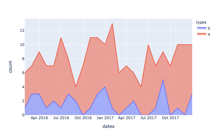
Figure 5 — Time series of two data points as area plots. Generated with Plotly Express by the Author Justin Chae
.Now, the same data represented as a regression curve.
fig = px.scatter(df
                 , x='dates'
                 , y='count'
                 , color='types'
                 , trendline='lowess'
                 )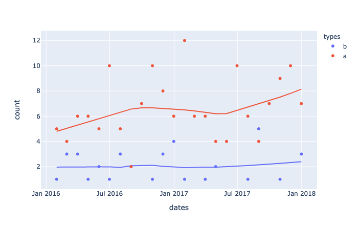
Figure 6 — Times series as scatter with Regression line. Generated with Plotly Express by the Author Justin Chae
This is all great, but how can we overlay the regression curve on top of the time series? There are a few ways to get the job done but after hacking at this, I decided to use Graph Objects to draw the charts and Plotly Express to generate the regression data.
Re-draw time series starting with Plotly Graph Object
This time, in order to fill in the area under each line, add the fill=’tozeroy’ as a parameter to the add_trace() method.
import plotly.graph_objects as go
import plotly_express as px

# group the dataframe
group = df.groupby('types')

# create a blank canvas
fig = go.Figure()

# each group iteration returns a tuple
# (group name, dataframe)
for group_name, df in group:
    fig.add_trace(
        go.Scatter(
            x=df['dates']            ,
            y=df['count']            ,
            fill='tozeroy'
        ))
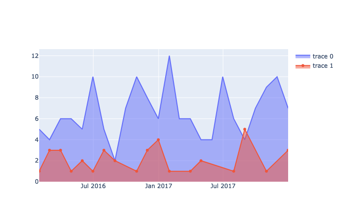
Figure 7 — Similar area chart as before but this time drawn as traces. Generated with Plotly Graph Objects by the Author Justin Chae
Combine Plotly Express and Graph Objects in a Loop
Here is the trick that I adapted from a Stack Overflow post where someone wanted to add a trendline to a bar chart. The insight — when we use Plotly Express to generate the trendline, it also creates data points — these points can be accessed as plain x, y data just like the counts in our DataFrame. As a result, we can plot them in the loop as a Graph Object.
To reiterate, we are plotting two categories of data to a graph with Graph Objects but using Plotly Express to generate data points for each category’s trend.
import plotly.graph_objects as go
import plotly_express as px

# group the dataframe
group=df.groupby('types')

# create a blank canvas
fig=go.Figure()

# each group iteration returns a tuple
# (group name, dataframe)
for group_name, df in group:
    # in each loop, draw a time series then a regression line
    fig.add_trace(
        go.Scatter(
            x = df['dates']            ,
            y = df['count']            ,
            fill = 'tozeroy'
        ))
    # source: https://stackoverflow.com/questions/60204175/plotly-how-to-add-trendline-to-a-bar-chart
    # generate a regression line with px
    help_fig = px.scatter(
        df,
        x = df['dates'],
        y = df['count'],
        trendline="lowess")
    # extract points as plain x and y
    x_trend=help_fig["data"][1]['x']
    y_trend=help_fig["data"][1]['y']

    # add the x,y data as a scatter graph object
    fig.add_trace(
        go.Scatter(x=x_trend, y=y_trend, name='trend'))
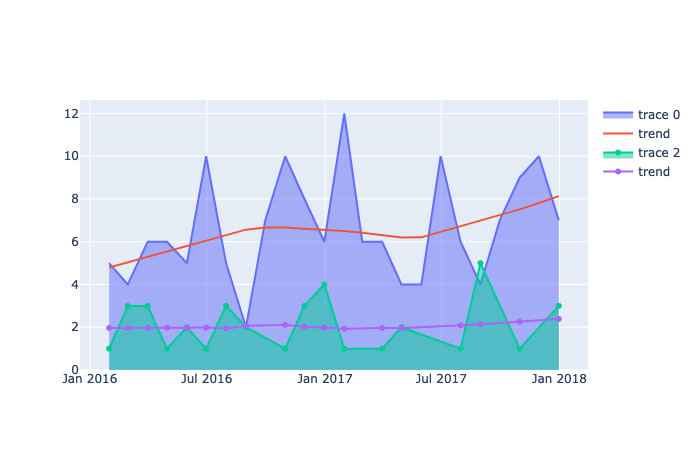
Figure 8— A Plotly Graph Object with lines as area charts over time with trend lines. Generated with Plotly by the Author Justin Chae
Some Housekeeping
At this point we have the foundational graph object with lines and trends but it would be nice to clean up a few things. For example, the labels are not very helpful and the colors are off. To take care of some housekeeping issues, add more parameters to the go.Scatter() method. Since we are passing a grouped DataFrame in a for loop, we can iteratively access the name of the group and the elements of the DataFrame. In the final version of this code, notice the parameters for line and name in the scatter objects to specify a dashed line among others.
import pandas as pd
import plotly.graph_objects as go
import plotly_express as px

gitcsv='https://raw.githubusercontent.com/justinhchae/medium/main/sample.csv'
df=pd.read_csv(gitcsv, index_col=0)

df['dates'] =pd.to_datetime(df['dates'])

freq='M'# or D or Y

df=df.groupby(['types', pd.Grouper(key='dates', freq=freq)])['types'].agg(['count']).reset_index()
df=df.sort_values(by=['dates', 'count']).reset_index(drop=True)

# group the dataframe
group=df.groupby('types')

# create a blank canvas
fig=go.Figure()

# each group iteration returns a tuple
# (group name, dataframe)
for group_name, df in group:
    fig.add_trace(go.Scatter(
        x=df['dates']            ,
        y=df['count']            ,
        fill='tozeroy'            ,
        name=group_name
    ))

    # generate a regression line with px
    help_fig = px.scatter(
        df,
        x=df['dates'],
        y=df['count']                          ,
        trendline="lowess")

    # extract points as plain x and y
    x_trend = help_fig["data"][1]['x']
    y_trend = help_fig["data"][1]['y']

    # add the x,y data as a scatter graph object
    fig.add_trace(
        go.Scatter(x=x_trend, y=y_trend
            , name=str('trend '+group_name)
            , line=dict(width=4, dash='dash')))

    transparent='rgba(0,0,0,0)'

    fig.update_layout(
        hovermode='x',
        showlegend=True
        # , title_text=str('Court Data for ' + str(year))
        , paper_bgcolor=transparent
        , plot_bgcolor=transparent
        , title='Monthly Time Series of A and B with Regression'
    )

fig.show()
A complete graphing solution.
The final result after grouping an aggregated DataFrame and plotting it with a for-loop.
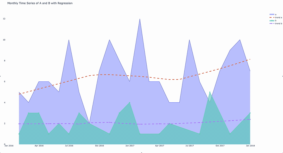
Figure 9 — Data over time showing counts of different categories with a trend line overlay. Generated with Plotly by the Author Justin Chae
As a final step to deploy to the web, I am currently developing on Streamlit. You can see a web version of this sample project here and check out another article on how to deploy code with Streamlit in the link below. In addition, the entire source project behind this article and the app is available in my GitHub repo here.
Conclusion
In this article, I present one way to plot data with Plotly Graph Objects to a time series with trend lines. The solution generally entails grouping the data by the desired time period, then grouping the data again by sub-category. After grouping the data, use the Graph Objects library and a second add trace with a for-loop. Then, within each loop generate data and plot data for a regression line.
The result is an interactive graph that shows counts over time with trend lines for each category of data. Not covered in this article is how to deploy the final visualization; however, resources are provided on how to accomplish this task.
Source: Towards Data Science
The Tech Platform


Comments