
How to use Plotly as Pandas Plotting Backend
- The Tech Platform

- Jul 15, 2021
- 5 min read
Updated: Mar 14, 2023
Libraries in the Scipy Stack work seamlessly together. In terms of visualization, the relationship between pandas and maltplotlib clearly stands out. Without even importing it, you can generate matplotlib plots with the plotting API of pandas. Just use the .plot keyword on any pandas DataFrame or Series and you will get access to most of the functionality of maptlotlib:
tips.plot.scatter(x="total_bill", y="tip", figsize=(10, 6))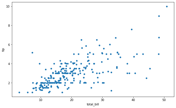
Although matplotlib is awesome and still the most widely-used visualization library, in recent years, there has been a clear trend to move away from old-fashioned static plots matplotlib offers. Specifically, libraries like plotly, bokeh and altair now offer interactive plots for boring Jupyter notebooks. This allows you to zoom in, pan, and interact with the generated plot in many ways making data analysis more enjoyable and informative.
However, learning a new library just for the sake of interactivity may not be worth the pain. Fortunately, starting from version 0.25 pandas has a mechanism for changing its plotting backend. This means you can enjoy most benefits of plotly without having to learn much of its syntax.
In this post, we will focus on how to get the most out of pandas plotting API with plotly as backend.
Installation, Jupyter, and Pandas Setup
Though you don’t have to import plotly, you have to install it in your workspace. Also, there are a few other steps required so that plotly charts can be rendered properly on both Jupyter Lab and classic Jupyter.
You can install the library both with pip and conda:
pip install plotly == 4.14.3
conda install-cplotly plotly = 4.14.3
For classic Jupyter, run these additional commands to fully set up plotly:
# pip
pip install "notebook> = 5.3" "ipywidgets> = 7.5"

# conda
conda install "notebook> = 5.3" "ipywidgets> = 7.5"
For Jupyter Lab support, run these commands:
# pip
pip install jupyterlab "ipywidgets> = 7.5"

# conda
conda install jupyterlab "ipywidgets> = 7.5"

# JupyterLab renderer support
jupyterlabextension install jupyterlab-plotly@ 4.14.3

# Jupyter widgets extension
jupyter labextension install @jupyter-widgets/jupyterlab-managerplotlywidget@ 4.14.3
All the above steps ensure that plotly runs in Jupyter without a hitch.
Now on to switching the backend. If you run the below command, you will see the current plotting backend of pandas:
>>>pd.get_option("plotting.backend")
'matplotlib'
To change this to plotly, just run:
# Set plotly as backend
>>>pd.set_option("plotting.backend", "plotly")

# Check
>>>pd.get_option("plotting.backend")
'plotly'
You can change all default global pandas settings with a few commands like above. There is so much you can do with them that I have another article for it. Check it out here.
Creating Different Plots
Pandas supports 13 types of plotly plots which can all be triggered using the kind keyword argument while calling plot on any DataFrame or a Series.
Pandas also supports dot notation to trigger plots but this method is not available for all plots. Here is a complete list of them divided by the two methods:
only with kind keyword: violin, strip, funnel, density_heatmap, density_contour and imshow
either kind or dot notation: scatter, line, area, bar, barh, hist, box plus the above plots
Today, all the plots will be on the Tips dataset that is built-in to plotly. Let's load it:
import plotly.express as px

tips = px.data.tips()
tips.head()
>>>tips.info()

<class 'pandas.core.frame.DataFrame'>
RangeIndex: 244 entries, 0 to 243
Data columns (total7columns):
#   Column      Non-Null Count  Dtype
--- -------     --------------   ----
0   total_bill   244 non-null   float64
1   tip          244 non-null   float64
2   sex          244 non-null   object
3   smoker       244 non-null   object
4   day          244 non-null   object
5   time         244 non-null   object
6   size         244 non-null   int64
dtypes: float64(2), int64(1), object(4)
memoryusage: 13.5+ KB
Let’s create a few plots to understand the dataset better:
tips.plot.hist(x="total_bill")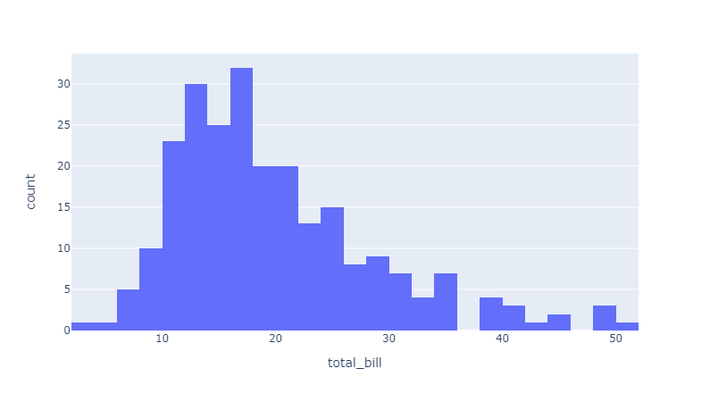
From the above histogram, which was created using dot notation, we can see that most of the bills were between 10 and 20$. Let’s see if larger bills are correlated with the tip amount using a scatterplot:
tips.plot.scatter(x="total_bill", y="tip")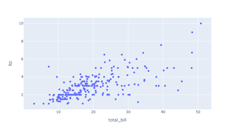
Again with dot notation, scatterplot shows a positive trend between the bill and tip amounts.
Let’s create a bar chart to see which week of the day brought more revenue for the restaurant:
tips.groupby("day")["total_bill"].sum().plot(kind="bar")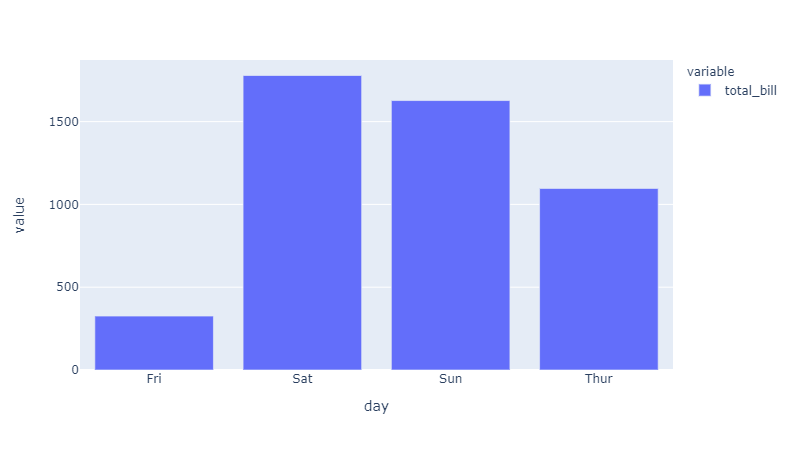
With a bit of pandas manipulation with groupby, we can see that the weekends are clear winners in revenue. We can do the same for the time of the day:
tips.groupby("time")["total_bill"].sum().plot(kind="bar")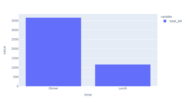
Not surprisingly, there were more dinner-time clients.
So far, we have only looked at two variables at a time. But you can always add more variables depending on your plot. For example, using color, symbol and size keyword arguments, you can encode more variables using different colors, symbols, and varying sizes for the dots of scatterplot based on the columns of the dataset:
tips.plot.scatter(x="total_bill", y="tip", color="time", size="size")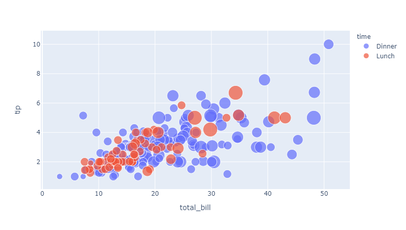
Above is a scatterplot with 4 variables. The color of the dots represents the time of the day while the size indicates the table size of each order in the restaurant.
In a nutshell, you will basically get access to almost all functionality of the plot if it is available in the pandas plotting API. To further control your plots, just search the plotly documentation for the plot and you are set.
Controlling axes labels, title, and legend of plots
Almost always, you will want to customize axes labels and texts in your plot. Using the labels keyword enables you to achieve this:
tips.plot.scatter(
    x="total_bill",
    y="tip",
    color="time",
    labels={
        "total_bill": "Total Bill ($)",
        "tip": "Tip Amount ($)",
        "time": "Time of the Day",
    },
    title="Total Bill vs. Tip Amount For Different Times of the Day",
)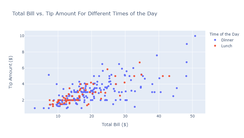
labels argument accepts a dictionary that maps column names to the new, desired labels. Note that the legend title can also be changed in this way because, by default, legends have the name of a column name in the dataset.
Changing the title should not be included in this dictionary. Instead, it should be given as a separate keyword argument — title.
Faceting
One advantage of plotly backend is that you can directly use faceting in the pandas plotting API which is not available for other libraries.
plotly provides facet_row and facet_col arguments to enable this feature:
tips.plot.scatter(
    x="total_bill",
    y="tip",
    facet_col="day",
    facet_col_wrap=2,
    facet_row_spacing=0.05,
    facet_col_spacing=0.05,
    height=800,
    width=800,
    labels={
        "tip": "Tip ($)",
        "total_bill": "Bill Amount ($)",
        "day": "Day"
    },
    title="Bill vs. Tip On Different Days of the Week",
 )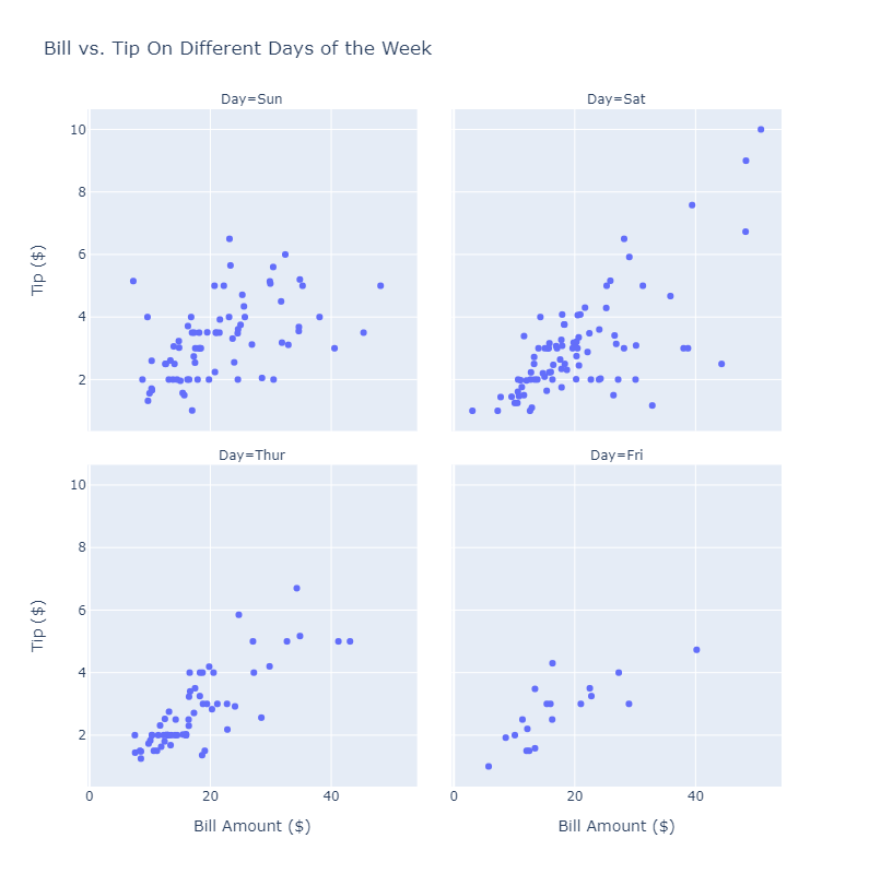
In the above plot, we are faceting by the day of the week and using facet_col_wrap of 2. You can also control the spacing between each facet using facet_row_spacing and facet_col_spacing which gives plots a little room to breathe. You should also control the figure size which can be done with height and width arguments.
Let’s see a final example using both row and column faceting:
tips.plot.scatter(
    x="total_bill",
    y="tip",
    color="smoker",
    facet_col="time",
    facet_row="day",
    facet_col_wrap=2,
    facet_row_spacing=0.05,
    facet_col_spacing=0.05,
    height=800,
    width=800,
    labels={
        "tip": "Tip ($)",
        "total_bill": "Bill Amount ($)",
        "day": "Day",
        "time": "Time",
        "smoker": "Smoker",
     },
     title="Bill vs. Tip On Different Days of the Week",
)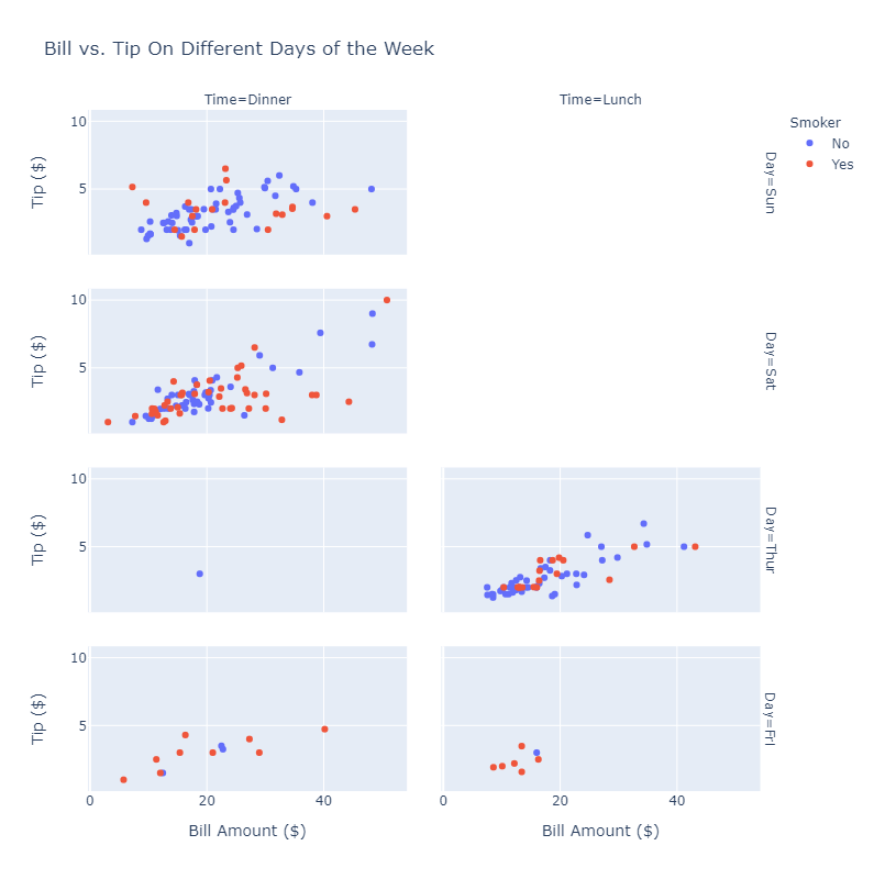
If you don’t know what values to set for spacing, just use large numbers because there is a limit to their size which is controlled by plotly. You will just end up with the largest facets possible. And yes, it CAN get pretty hairy once you throw too many things into a single line of code
Conclusion
We have taken a look at the fundamentals of pandas plotting API with plotly backend. Using the API is ideal for quick exploration and to create interactive plots with only a few lines of code. The API also lets you enjoy plotly features without having to learn too much new syntax.
Source: Medium ; Bex T.
The Tech Platform

Comments