
Power Apps (using templates or build from scratch with OneDrive and sharepoint) : Session 3
- The Tech Platform

- Feb 2, 2021
- 6 min read
The Tech Platform Presents Talks with Aroh Shukla on Power Apps (using templates or build from scratch with OneDrive and sharepoint).
Subscribe us at www.thetechplatform.com for more articles and live events.
Below we have the links for Youtube and Facebook Video:
Youtube - https://youtu.be/UIjnVLnUYjM
Data Sources
In Power Apps, most canvas apps use external information stored in cloud services called Data Sources. • A common example is a table in an Excel file stored in OneDrive for Business or SharePoint.


Data sources can be connected to a cloud service, or they can be local to an app.
1. Connected data sources
The most common data sources are tables, which you can use to retrieve and store information. You can use connections to data sources to read and write data in Microsoft Excel workbooks, SharePoint lists, SQL tables, and many other formats, which can be stored in cloud services such as OneDrive for Business, DropBox, and SQL Server.
Data sources other than tables include email, calendars, Twitter, and notifications, but this article doesn't discuss these other kinds of data sources.
2. Local data sources
Using the Gallery, Display form, and Edit form controls, it is easy to create an app that reads and writes data from a data source. To get started, read the article Understand data forms.
When you ask Power Apps to create an app from data, these controls are used. Behind the scenes, the app uses an internal table to store and manipulate the data that comes from the data source.
A special kind of data source is the Collection, which is local to the app and not backed by a connection to a service in the cloud, so the information can not be shared across devices for the same user or between users. Collections can be loaded and saved locally.
Data Gateway
By using a gateway, organizations can keep databases and other data sources on their on-premises networks, yet securely use that on-premises data in cloud services.

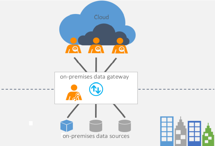
How the gateway works
Let’s first look at what happens when you interact with an element that is connected to an on-premises data source.
The cloud service creates a query and the encrypted credentials for the on-premises data source. The query and credentials are sent to the gateway queue for processing.
The gateway cloud service analyzes the query and pushes the request to Azure Service Bus Messaging.
Azure Service Bus sends the pending requests to the gateway.
The gateway gets the query, decrypts the credentials, and connects to one or more data sources with those credentials.
The gateway sends the query to the data source to be run.
The results are sent from the data source back to the gateway and then to the cloud service. The service then uses the results.
In step 6, queries like Power BI refreshes and Azure Analysis Services refreshes can return large amounts of data. For such queries, data is temporarily stored on the gateway machine. This data storage continues until all data is received from the data source. The data is then sent back to the cloud service. This process is called spooling. We recommend you use a solid-state drive (SSD) as the spooling storage.
Types of gateways
There are two different types of gateways, each for a different scenario:
On-premises data gateway allows multiple users to connect to multiple on-premises data sources. You can use an on-premises data gateway with all supported services, with a single gateway installation. This gateway is well-suited to complex scenarios with multiple people accessing multiple data sources.
On-premises data gateway (personal mode) allows one user to connect to sources, and can’t be shared with others. An on-premises data gateway (personal mode) can be used only with Power BI. This gateway is well-suited to scenarios where you’re the only person who creates reports, and you don't need to share any data sources with others.
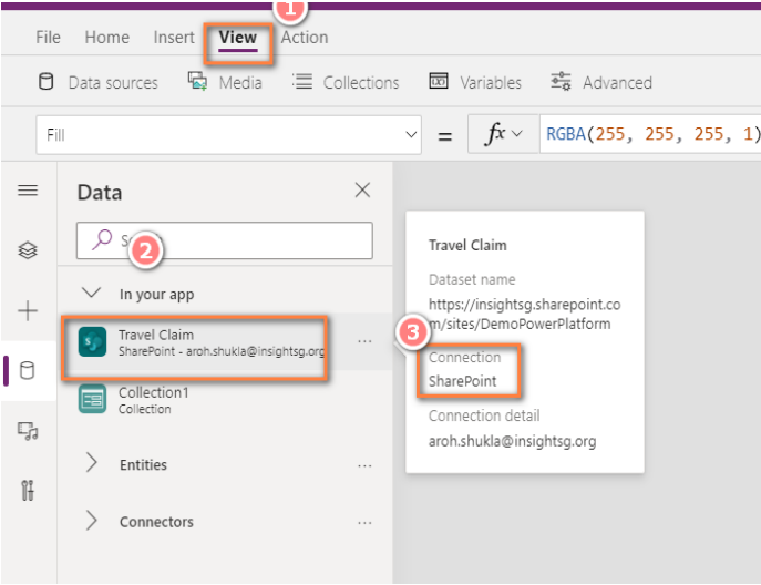
Connections
Data is stored in a data source, and you bring that data into your app by creating a connection. The connection uses a specific connector to talk to the data source. • Power Apps has connectors for many popular services and on-premises data sources, including SharePoint, SQL Server, Office 365, Salesforce, and Twitter.

Connectors
Power Apps has more than 300+ connectors. Power Apps has connectors for many popular services and on-premises data sources, including SharePoint, SQL Server, Office 365, Salesforce, and Twitter. • Power Apps can connect to 2 types of connector • Standard Connector • Premium Connector


Galleries
A Gallery control can show multiple records from a data source, and each record can contain multiple types of data. • For example, use a Gallery control to show multiple contacts with each item showing contact information that includes a name, an address, and a phone number for each contact.


Each data field appears in a separate control within the Gallery control. And you can configure those controls in its template. The template appears as the first item inside the gallery:
On the left edge of a Gallery control in horizontal/landscape orientation.
And at the top of a Gallery control in vertical/portrait orientation.
Any changes that you make in the template are reflected throughout the Gallery control.
Predefined templates for showing images and text in a gallery are available, and a gallery for variable-height items.
Limitations
If a user scrolls the Flexible height gallery control before all items are loaded, the item that's currently in view may be pushed down and out of view when the data loading is finished. To avoid this issue, use a standard Gallery control instead of the Flexible height variant.
Key properties
Default – The item or record from the data source to be selected in the gallery when the app starts up.
Items – The source of data that appears in a control such as a gallery, a list, or a chart.
Selected – The selected item.
Additional properties
AccessibleLabel – Label of the gallery (not the items it contains) for screen readers. Should describe what the list of items are.
AllItems – All items in a gallery, including additional control values that are a part of the gallery's template.
BorderColor – The color of a control's border.
BorderStyle – Whether a control's border is Solid, Dashed, Dotted, or None.
BorderThickness – The thickness of a control's border.
DelayItemLoading - Delay loading of items (rows) until after the screen first loads.
DisplayMode – Whether the control allows user input (Edit), only displays data (View), or is disabled (Disabled).
Fill – The background color of a control.
Height – The distance between a control's top and bottom edges.
ItemAccessibleLabel – Label of each gallery item for screen readers. Should describe what each item is.
LoadingSpinner (None, Controls or Data) - When None, spinner will not be shown. When Controls | Data, spinner will be shown when a render pass occurs that results in visible empty rows.
LoadingSpinnerColor - The fill color of the loading spinner. Default is set to BorderColor.
NavigationStep – How far a gallery scrolls if its ShowNavigation property is set to true and the user selects a navigation arrow at either end of that gallery.
Selectable – Whether gallery items can be selected. When set to true, screen readers identify the gallery as a selectable list. And you select an item by selecting it. When set to false, screen readers identify the gallery as a regular list, and selecting an item doesn't select it.
ShowNavigation – Whether an arrow appears at each end of a gallery so that a user can scroll through the items in the gallery by selecting an arrow.
ShowScrollbar – Whether a scrollbar appears when the user hovers over a gallery.
TemplateFill – The background color of a gallery.
TemplatePadding – The distance between items in a gallery.
TemplateSize – The height of the template for a gallery in vertical/portrait orientation. Or the width of the template for a gallery in horizontal/landscape orientation.
Transition – The visual effect (Pop, Push, or None) when the user hovers over an item in a gallery.
Visible – Whether a control appears or is hidden.
Width – The distance between a control's left and right edges.
WrapCount – Number of items shown per row or column based on horizontal or vertical layout.
X – The distance between the left edge of a control and the left edge of its parent container or screen.
Y – The distance between the top edge of a control and the top edge of the parent container or screen.
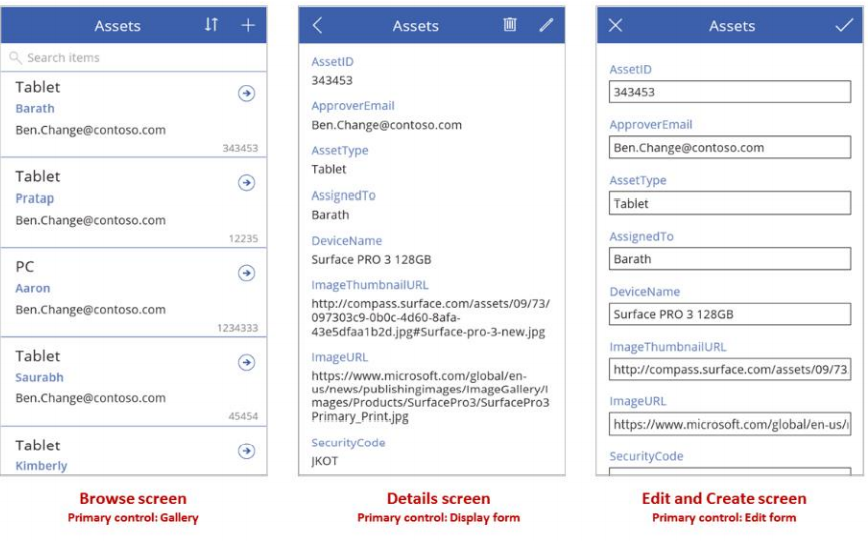
Form
Add three types of controls to a canvas app so that the user can browse for a record, display details about that record, and edit or create a record:
Activity Control Description
Browse for a record Gallery control Filter, sort, search, and scroll through records in a
data source, and select a specific record. Display
only a few fields from each record to show several
records at a time, even on a small screen.
Show details of a record Display form control For a single record, display many or all fields in that
record.
Edit or create a record Edit form control Update one or more fields in a single record (or
create a record starting with default values), and
save those changes back to the underlying data
source.
Put each control on a different screen to make them easier to distinguish:

As this topic describes, combine these controls with formulas to create the overall user experience.
Canvas : Standard vs Customized list
Standalone Power Apps and SharePoint Customized List form are essential same. However, there are a few important differences that need to weigh before an avenue is chosen.


For any further information or queries for this article and any other article, mail us at


Comments