
Details Screen
- The Tech Platform

- Feb 1, 2021
- 2 min read
Power Apps can automatically generate an app based on a data source that you specify. Each app contains three screens with the controls described earlier and formulas that connect them. Run these apps "out of the box," customize them for your specific goals, or examine how they work so that you can learn useful concepts that apply to your own apps. In the following sections, inspect the screens, controls, and formulas that drive a generated app.


This screen features these key formulas:

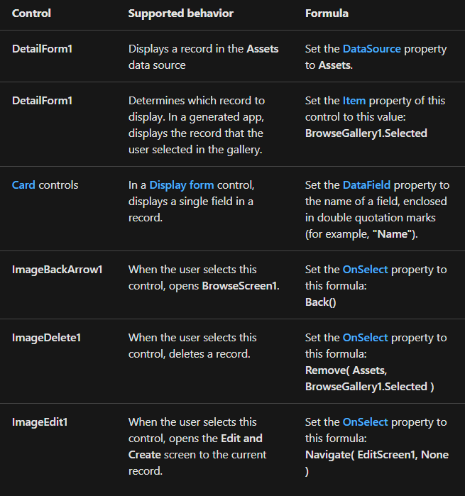
At the top of the screen, three images sit outside of DetailForm1 and act as buttons, orchestrating between the three screens of the app.
DetailForm1 dominates this screen and displays the record that the user selected in the gallery (because the form's Item property is set to BrowseGallery1.Selected). The DataSource property of the form also provides metadata about the data source, such as a user-friendly display name for each field.
DetailForm1 contains several Card controls. You can select either the Card control itself or the control that it contains to discover additional information.


The DataField property of a Card control determines which field the card displays. In this case, that property is set to AssetID. The card contains a Label control for which the Text property is set to Parent.Default. This control shows the Default value for the card, which is set through the DataField property.
In a generated app, Card controls are locked by default. When a card is locked, you can't modify some properties, such as DataField, and the formula bar is unavailable for those properties. This restriction helps ensure that your customizations don't break the basic functionality of the generated app. However, you can change some properties of a card and its controls in the right-hand pane:

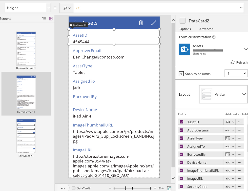
In the right-hand pane, you can select which fields to display and in which kind of control each field displays.


Comments