
Pivot Tables made simple with atoti
- The Tech Platform

- Feb 27, 2021
- 4 min read
What are pivot tables and how are they useful?
Just to benefit emerging analysts like me, a pivot table is a table of statistics that summarizes the data of a more extensive table. They help bring to light useful information in your data. They are really useful when you want the power to aggregate and analyse your data but not lose out on the power to see each individual contributor.
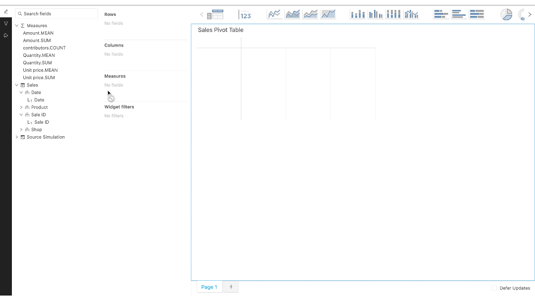
Sample Pivot Table
Back to the hurdle I was facing, all my projects till then only involved the use of Jupyter notebooks to perform my analysis in the back end and generating a report to submit, most probably a pdf or a PPT. Even though I have some experience in HTML and Django, creating a fully functional dashboard with interactive pivot tables is not something I could do within a week.
With this daunting issue at hand, I did what any other data scientist would do and Googled my problem. And lo!, I came across this wonderful tool atoti.
Understanding atoti and Harnessing its power
atoti is a tool designed to help anyone who works with data to analyse and share their findings more easily, with meaningful visualisations and real-world impacts. And what is even better is that it can be integrated right with your python notebooks and enhances your Jupyter environment!
Installing atoti
atoti can be easily installed with its Jupyter Lab extension —
pip install atoti[jupyterlab]Using atoti
Given that we have now installed atoti as a python package, we can import it and jump right into using it.
import atoti as ttsession = tt.create_session()Creating a simple pivot table
For the purpose of this post, I have created a pivot table using a dummy Pandas dataframe and deployed it in a dashboard. atoti can also take other datasources such as csv, parquet, numpy, spark, sql, kafka.

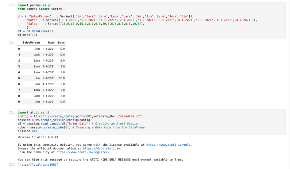
Code Snippet for creating basic pivot table
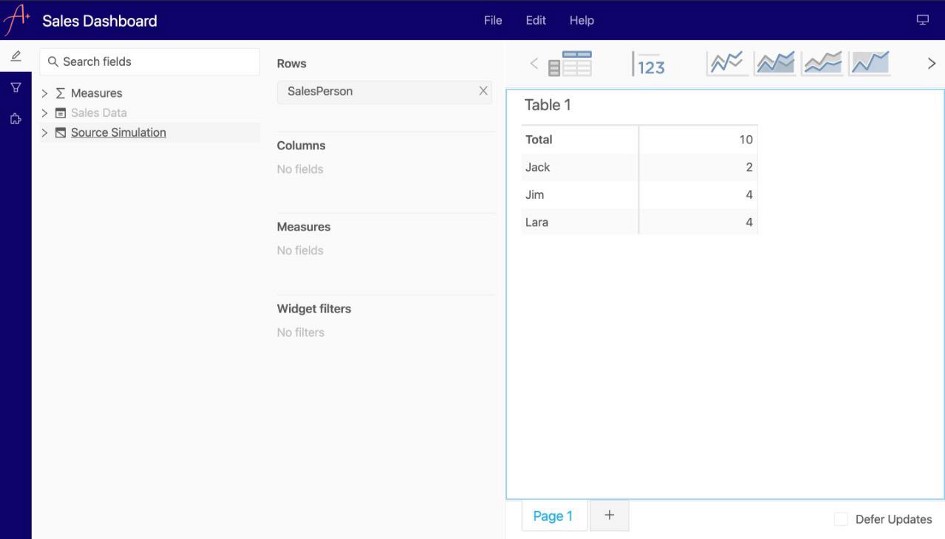
Here, I have created my own simple Data Frame with the name of the sales person, the date on which they made the sale, and the amount of the sale. Now using atoti, I have created a session and deployed my Dashboard which can be accessed with the url printed.
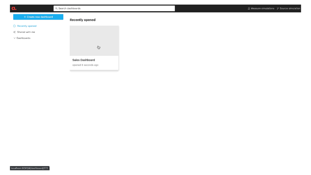
Created Dashboard
As you can see, we have created and deployed a professional dashboard with less than 20 lines of code.
Data Structuring in atoti
At the heart of atoti lies Data Cubes. A Data Cube is a multidimensional view of the data and helps us explore, aggregate, filter and compare. It is called a cube because each attribute of the data can be represented as a dimension of the cube. The axes of the cubes are known as hierarchies and the individual numeric indicators at specific co-ordinates are known as measures.
We can get a better understanding of this from the basic tutorial in their webpage.
atoti with Jupyter Lab
A boon for every Data Scientist is atoti’s integration with Jupyter Lab. Here, we can visualise our data cube right in our Jupyter Notebook as widgets and add them directly to the Dashboard.
In fact, you can give your visualization a title `session.visualize(“title”)`, right click on the visualization and publish to app.
This way, from the dashboard, you can access your visualization from the widgets drawer.

Widgets in Jupyter Lab
Other Visualisations using atoti
Generally, I spend a lot of time in setting up beautiful visualisations to project to the client given that this is an integral part of being a Data Scientist. Even though working with Seaborn and Matplotlib is not very difficult, they are undeniably time consuming. Here too atoti comes to the rescue!
I created this clustered bar chart straight from the dashboard, in less than a minute! atoti uses plotly to build its charts

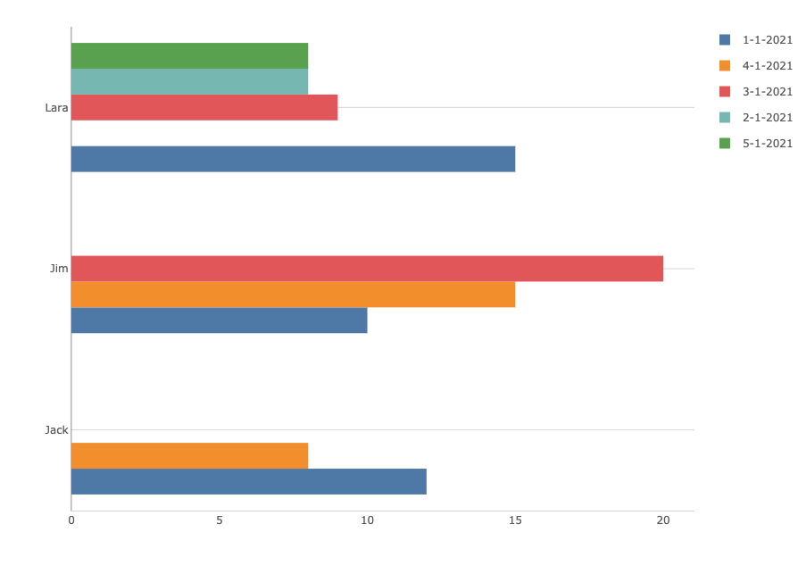
Clustered Bar Chart
We can just shift our underlying data to any visualisation with just a few clicks.

Changing visualisation
Saving Dashboards
If we configure the session so that the cell metadata is stored in a .db file, then we can directly save state of the dashboard. It helps keep your graphs/visualisations ready before your big presentation. All widgets that you exported from your Jupyter notebook will also be saved.
conf = tt.config.create_config(
    port=8081, metadata_db="./metadata.db"
)
session = tt.create_session(config=conf)
Another amazing feature with I used often is the ability to directly export pivot tables in their current state to .CSV files for future use!

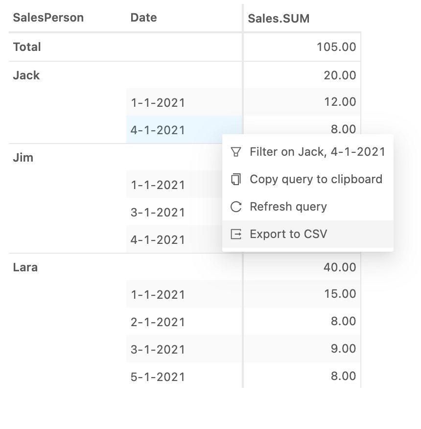
Export Pivot table to CSV
If you save the dashboard, you can also share it with your peers using its url!
Atoti+
Atoti+ is the paid version of atoti which I tried out. It provides some additional benefits over the free version. Of these I’ve mentioned the two features which I think would be most useful to users.
Branding using Atoti+
Aoti+ allows its users to make cosmetic changes to the dashboard. It enables the user to set logos, favicons, frame color, accent colors etc. This feature comes in handy, if like me, you are making a dashboard for a client and they insist on a specific combination of colors be used.

Branding with Atoti+
Setting user roles and Authentication
When using Atoti+ one can define roles of users and set respective constraints. In the sample dashboard that I created, I defined a user and the associated role.
user = tt.config.create_basic_user(
    "usersp", "usersp", roles=["ROLE_SALES1"]
)
basic = tt.config.create_basic_authentication(
    users=[user]
)
role = tt.config.create_role(
    name="ROLE_SALES1",
    restrictions={"SalesPerson": "Jim"},
)
config = tt.config.create_config(
    port=8081,
    metadata_db="./metadata.db",
    authentication=basic,
    roles=[role],
)
Now, when we try to access the dashboard, we are greeted by a screen which requests a passcode and then displays data constrained by the login credentials, all using a single port!
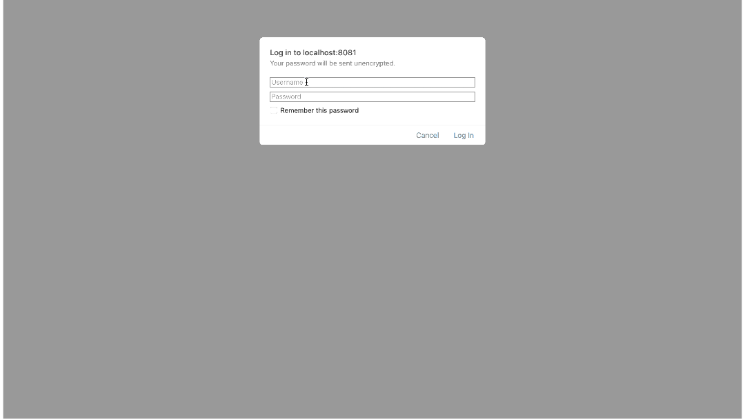
User based login using Atoti+
In Conclusion…
I believe that atoti has the potential to be the golden standard for data visualisation and presentation. Like I mentioned in the introduction of this article, this whole community of data scientists is held together by people who go out of their way to help others, and I’d like to play a small part by introducing people to this simple yet powerful tool that I am sure will ease the workload of many!
Source: Medium
The Tech Platform


Comments