
Introduction to Data Visualization in Python
- The Tech Platform

- Oct 27, 2020
- 11 min read
Updated: Jan 18, 2024
Data visualization serves as a powerful tool in data analysis, providing a visual context that enhances our understanding of complex datasets. By translating raw data into graphical representations, we can uncover patterns, identify trends, and reveal correlations that might remain hidden in numerical tables. In the Python ecosystem, various libraries offer robust solutions for creating compelling visualizations. This article provides an introductory exploration of the importance of data visualization, its role in data interpretation, and an overview of prominent Python libraries dedicated to this purpose.
Table of Contents:
Graphical Representation vs Raw Data Analysis
Matplotlib
Pandas Visualization
Seaborn
Box Plot
Heatmap
Faceting
What is Data Visualization?
Data visualization is a crucial discipline aimed at unraveling the complexities of data by presenting it in a visual context. This practice facilitates the identification of patterns, trends, and correlations that might remain elusive in raw data. By employing graphical or pictorial formats, data visualization enables stakeholders and decision-makers to analyze information intuitively.
This approach not only simplifies the comprehension of complex quantitative data but also allows for the easy identification of new trends and patterns.
Benefits of Data Visualization:
Simplifying Complexity: The foremost advantage lies in simplifying intricate quantitative information, making it accessible to a broader audience.
Analyzing Big Data: Data visualization assists in the exploration and analysis of large datasets, providing a clearer understanding of complex information.
Identifying Areas for Improvement: Visualization aids in pinpointing areas that require attention or improvement, guiding decision-makers toward more informed choices.
Revealing Relationships: By representing data points and variables graphically, data visualization uncovers relationships that might go unnoticed in traditional data analysis.
Exploring New Patterns: Visualization techniques help in exploring new patterns and revealing hidden insights within the data.
Major Considerations for Data Visualization:
Clarity: Ensuring completeness and relevance of the dataset is crucial. This guarantees that data scientists can leverage new patterns effectively in relevant contexts.
Accuracy: The use of appropriate graphical representations is essential to convey the intended message accurately and avoid misinterpretation.
Efficiency: Employing visualization techniques that efficiently highlight all relevant data points ensures that insights are not overlooked.
Basic Factors in Data Visualization:
Visual Effects: The use of suitable shapes, colors, and sizes to represent analyzed data enhances the visual impact of the presentation.
Coordination System: Organizing data points within a designated coordinate system helps maintain order and clarity in the visualization.
Data Types and Scale: Choosing the appropriate representation based on data types (numeric or categorical) and scale ensures accurate and meaningful visualizations.
Informative Interpretation: Effective visualizations incorporate informative interpretation through labels, titles, legends, and pointers, aiding in easy comprehension.
Graphical Representation vs Raw Data Analysis
The choice between graphical representation and raw data analysis plays a crucial role in how insights are extracted, understood, and communicated. Each approach has its advantages and limitations, and the decision often depends on the goals of the analysis and the nature of the dataset.
Aspect | Graphical Representation | Raw Data Analysis |
Immediate Visualization | Advantages: Provides an immediate and intuitive visualization of complex data. Patterns and trends are more apparent visually. | Advantages: Offers precision and detailed examination of individual data points, allowing for a granular understanding of the dataset. |
Facilitates Communication | Advantages: Highly effective in communicating findings to a diverse audience. Simplifies complex concepts for individuals with varying levels of expertise. | Advantages: Essential for statistical rigor, providing detailed analyses required for specific research questions. |
Pattern Recognition | Advantages: Leverages human strength in pattern recognition. Quick identification of trends, clusters, and irregularities in the data. | Advantages: Enables custom analysis tailored to specific research questions. Allows for algorithmic processing, crucial for machine learning applications. |
Comparisons and Contrasts | Advantages: Allows easy comparison of different categories or variables. Facilitates visual comparisons for insights not immediately apparent in raw data. | Advantages: Important for cleaning and preprocessing data before visualization. Identifies and addresses issues such as missing values and outliers. |
Storytelling | Advantages: Aids in storytelling by creating a narrative around the data. Guides viewers through the data, emphasizing key points and discoveries. | Advantages: Provides data inputs essential for training and prediction in machine learning algorithms. Allows for customized queries based on specific research questions. |
Precision and Detail | Advantages: Provides precision and detailed examination of individual data points. Allows for a granular understanding of the dataset without abstraction introduced by visual representations. |
Plotting Libraries for Data Visualization
Plotting libraries are software tools or frameworks designed to facilitate the creation of graphical representations of data in a visual and easily interpretable format. These libraries provide a set of functions, methods, and pre-built components that allow users, typically data scientists, analysts, or programmers, to generate various types of charts, graphs, and plots based on their datasets.
The primary purpose of plotting libraries is to transform raw numerical or categorical data into visual forms, enabling users to analyze patterns, trends, and relationships within the data.
These libraries abstract the complexity of low-level graphics programming, providing a higher-level interface that allows users to focus on the data and the desired visual output. Plotting libraries may offer a range of plotting styles, customization options, and interactivity features, depending on their design and intended use cases.
Examples of popular plotting libraries:
1.Matplotlib:
Characteristics: Matplotlib operates at a low level, offering a plethora of options and extensive freedom for customization.
Strengths: Ideal for users seeking fine-grained control over every aspect of their plots, Matplotlib serves as the foundation for many other visualization libraries.
2. Pandas Visualization:
Characteristics: This library boasts an easy-to-use interface built on top of Matplotlib, making it accessible for users with varying levels of expertise.
Strengths: Pandas Visualization simplifies the process of creating basic plots directly from DataFrame objects, streamlining the visualization workflow for data analysts.
3. Seaborn:
Characteristics: Positioned as a high-level interface, Seaborn comes with great default styles and color palettes, enabling aesthetically pleasing visualizations.
Strengths: Ideal for users who prefer concise and elegant code, Seaborn simplifies the creation of statistical graphics with minimal effort.
4. ggplot:
Characteristics: Drawing inspiration from R's ggplot2, this library adheres to the Grammar of Graphics principles, emphasizing a structured approach to creating visualizations.
Strengths: ggplot is well-suited for users familiar with R and those who appreciate a declarative syntax for constructing complex plots.
5. Plotly:
Characteristics: Plotly stands out with its ability to generate interactive plots, enhancing the user experience by allowing exploration and manipulation of data directly in the visualizations.
Strengths: Particularly useful for applications requiring dynamic and engaging visualizations, Plotly excels in creating plots that respond to user interactions.
Each of these libraries has its strengths, features, and target audiences, making them suitable for different scenarios and preferences. Overall, plotting libraries play a crucial role in data analysis and communication by translating raw data into visual representations that are more accessible and understandable to a broader audience.
1. Matplotlib
Matplotlib stands as the most widely used Python plotting library, providing a versatile and low-level interface reminiscent of Matlab. Its popularity is attributed to the flexibility it offers, allowing users considerable freedom, albeit with the trade-off of potentially writing more code.
Installation:
Matplotlib can be installed using either pip or conda:
pip install matplotlibor
conda install matplotlibUsage:
To employ Matplotlib, import it as follows:
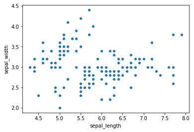
import matplotlib.pyplot as pltScatter Plot
A scatter plot is a type of plot that displays individual data points on a two-dimensional space. Each point on the graph represents an observation with two numerical variables, one on the x-axis and the other on the y-axis.
Pros: Ideal for basic graphs like line charts, bar charts, and histograms.
Cons: Requires more code for customization; may lack the elegance of higher-level interfaces.
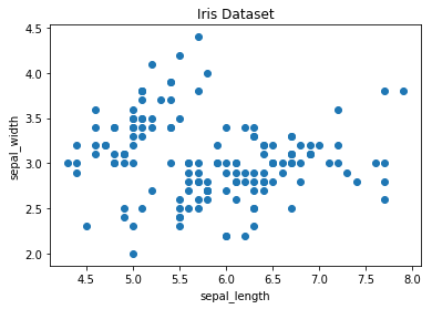
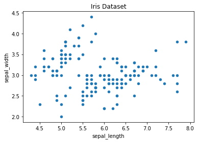
A scatter plot in Matplotlib is generated using the scatter method. The fundamental code snippet below demonstrates a basic scatter plot of sepal length against sepal width in the Iris dataset:
# create a figure and axis
fig, ax=plt.subplots()

# scatter the sepal_length against the sepal_width
ax.scatter(iris['sepal_length'], iris['sepal_width'])

# set a title and labels
ax.set_title('Iris Dataset')
ax.set_xlabel('sepal_length')
ax.set_ylabel('sepal_width')
Enhancing the Scatter Plot with Color:
To imbue the scatter plot with more meaning, each data point can be colored based on its corresponding class. This involves creating a color dictionary mapping each class to a specific color and then iterating through the data points to scatter them individually with the appropriate color:
# create color dictionary
colors = {'Iris-setosa': 'r', 'Iris-versicolor': 'g', 'Iris-virginica': 'b'}

# create a figure and axis
fig, ax = plt.subplots()

# plot each data-point with color based on class
for i in range(len(iris['sepal_length'])):
    ax.scatter(iris['sepal_length'][i], iris['sepal_width'][i], color=colors[iris['class'][i]])

# set a title and labels
ax.set_title('Iris Dataset')
ax.set_xlabel('sepal_length')
ax.set_ylabel('sepal_width')
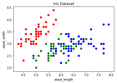
This approach enhances the scatter plot by introducing color-based differentiation, making it easier to discern the distinct classes within the Iris dataset.
Line Chart
A line chart is used to represent data points in a series over a continuous interval or period. It connects data points with straight lines, making it easy to visualize trends and patterns in the data.
Pros: Simple and effective for visualizing trends in data.
Cons: Limited aesthetics and features compared to specialized libraries.
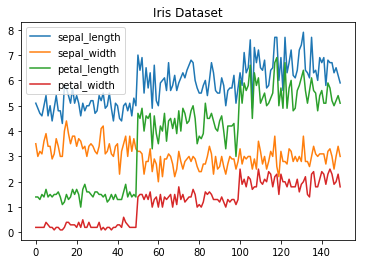
In Matplotlib, the generation of a line chart is accomplished through the utilization of the 'plot' method. Beyond plotting a single column, the flexibility of Matplotlib extends to the capability of visualizing multiple columns concurrently on a shared axis. This is achieved by iterating through the desired columns and systematically plotting each one on the same axis.
This approach authorizes users to examine various aspects of the dataset simultaneously, facilitating a more comprehensive understanding of trends and relationships within the data.
Consider the below example demonstrates how to create a line chart using the 'plot' method and how to plot multiple columns on the same graph.
import matplotlib.pyplot as plt
import pandas as pd

# Assuming iris is a DataFrame containing Iris dataset

# Get columns to plot, excluding the 'class' column
columns = iris.columns.drop(['class'])

# Create x data
x_data = range(0, iris.shape[0])

# Create figure and axis
fig, ax = plt.subplots()

# Plot each column
for column in columns:
    ax.plot(x_data, iris[column], label=column)

# Set title and legend
ax.set_title('Iris Dataset')
ax.legend()

# Display the line chart
plt.show()

Histogram
A histogram is a graphical representation of the distribution of a dataset. It divides the data into bins and displays the frequency or count of observations in each bin, providing insights into the underlying data distribution.
Pros: Straightforward creation of histograms for quick data analysis.
Cons: Limited customization for more complex visualizations.
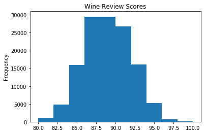
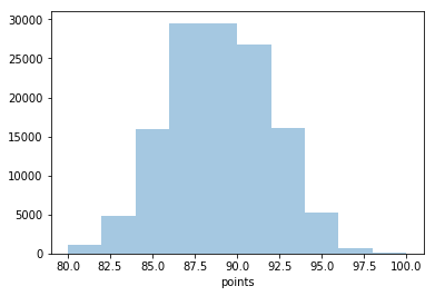
Consider the below example demonstrating how to create a histogram of wine review scores from the 'points' column in the 'wine_reviews' dataset.
import matplotlib.pyplot as plt
import pandas as pd

# Assuming wine_reviews is a DataFrame containing wine review data

# Create a figure and axis
fig, ax = plt.subplots()

# Plot a histogram for the wine review scores
ax.hist(wine_reviews['points'], bins=10, edgecolor='black')  # Adjust 'bins' for granularity

# Set title and labels
ax.set_title('Histogram: Wine Review Scores')
ax.set_xlabel('Points')
ax.set_ylabel('Frequency')

# Display the histogram
plt.show()
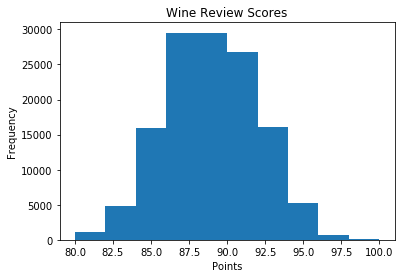
The above code creates a histogram to represent the distribution of wine review scores. Adjusting the bins parameter allows for granularity in the representation of the data, and the title and labels provide context for better interpretation.
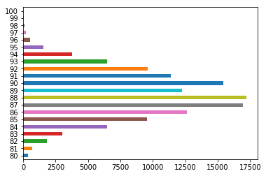
Bar Chart
A bar chart is used to represent categorical data with rectangular bars. Each bar's length or height corresponds to the value it represents, making it easy to compare values across different categories.
Pros: Effective for categorical data with a limited number of categories.
Cons: Can become cluttered with a large number of categories.
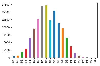
Consider the below example demonstrating how to create a bar chart using Matplotlib, emphasizing the use of the Pandas value_counts function for calculating the frequency of categories. The text also highlights that bar charts are particularly useful for categorical data with fewer than 30 categories to avoid visual clutter.
import matplotlib.pyplot as plt
import pandas as pd

# Assuming wine_reviews is a DataFrame containing wine review data

# Count the occurrence of each category using value_counts
data = wine_reviews['points'].value_counts()

# Extract x and y data
points = data.index
frequency = data.values

# Create a figure and axis
fig, ax = plt.subplots()

# Create a bar chart
ax.bar(points, frequency)

# Set title and labels
ax.set_title('Wine Review Scores')
ax.set_xlabel('Points')
ax.set_ylabel('Frequency')

# Display the bar chart
plt.show()
The above code generates a bar chart to visualize the distribution of wine review scores. The value_counts function is employed to obtain the frequencies of each unique score, and the resulting data is then used to create a bar chart. The title and labels provide context for better interpretation of the chart.
2. Pandas Visualization
Pandas, an open-source and high-performance library, offers a user-friendly interface for data manipulation and analysis, featuring essential data structures like dataframes and powerful tools for visualization. The Pandas Visualization module provides an effortless way to generate plots directly from Pandas dataframes and series, boasting a higher-level API compared to Matplotlib, leading to more concise code for achieving the same results.
Installation:
Pandas can be installed using either pip or conda:
pip install pandasor
conda install pandasScatter Plot:
Creating a scatter plot in Pandas is simplified with the plot.scatter() method. This method takes two arguments, the x-column and y-column names, and optionally a title.
The following code demonstrates a scatter plot of sepal length against sepal width in the Iris dataset:
iris.plot.scatter(x='sepal_length', y='sepal_width', title='Iris Dataset')
The resulting plot automatically labels the x and y-axis with the corresponding column names.
Line Chart:
Pandas makes line chart creation straightforward with the plot.line() method. Unlike Matplotlib, Pandas automatically plots all available numeric columns, eliminating the need for explicit column looping.
The example below generates a line chart for the Iris dataset:
iris.drop(['class'], axis=1).plot.line(title='Iris Dataset')
For datasets with multiple features, Pandas automatically generates a legend for easy interpretation.
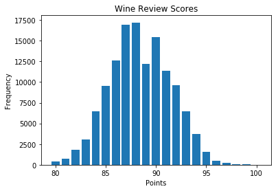
Histogram:
Pandas simplifies histogram creation using the plot.hist method. Without any required arguments, a basic histogram can be generated. The following code illustrates a histogram for wine review scores:
wine_reviews['points'].plot.hist()
Multiple histograms are easily created by setting the subplots argument to True, specifying layout, and adjusting the bin size:
iris.plot.hist(subplots=True, layout=(2,2), figsize=(10, 10), bins=20)

Bar Chart:
Pandas provides an intuitive method, plot.bar(), for creating bar charts. Before plotting, data needs to be prepared by counting occurrences using value_counts() and sorting them. The code snippet below generates a vertical bar chart for wine review scores:
wine_reviews['points'].value_counts().sort_index().plot.bar()
For a horizontal bar chart, the plot.barh() method is used:
wine_reviews['points'].value_counts().sort_index().plot.barh()
Beyond simple occurrences, Pandas allows for more complex bar chart visualizations. The following example groups wine review data by country, calculates the mean of wine prices, orders the data, and plots the top 5 countries with the highest average wine prices:
wine_reviews.groupby("country").price.mean().sort_values(ascending=False)[:5].plot.bar()
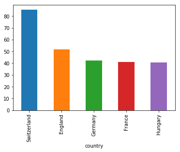
In this example, the data is grouped, aggregated, and visualized to showcase the countries with the highest average wine prices.
3. Seaborn
Seaborn, a Python data visualization library built on top of Matplotlib, offers a high-level interface for creating visually appealing graphs with ease. Its ability to generate sophisticated plots with concise code makes it a powerful tool for data visualization. Seaborn's default aesthetics are aesthetically pleasing, and it seamlessly integrates with Pandas dataframes, making it convenient for users.
Importing Seaborn:
To utilize Seaborn, it needs to be imported into the Python environment:
import seaborn as snsScatter plot
Creating a scatter plot in Seaborn involves using the scatterplot method. Similar to Pandas, you need to specify the x and y column names. However, in Seaborn, the data must be explicitly passed using the data parameter.
The following code demonstrates a scatter plot of sepal length against sepal width in the Iris dataset:
sns.scatterplot(x='sepal_length', y='sepal_width', data=iris)
To color the points by class, the hue argument is employed, simplifying the process compared to Matplotlib:
sns.scatterplot(x='sepal_length', y='sepal_width', hue='class', data=iris)

Line chart
For line charts, Seaborn provides the lineplot method. The only mandatory argument is the data, which, in this case, includes the four numeric columns from the Iris dataset:
sns.lineplot(data=iris.drop(['class'], axis=1))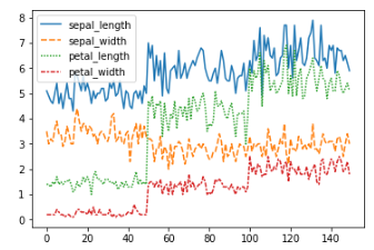
An alternative method, kdeplot, can be used for cleaner curves, especially when dealing with datasets containing outliers:
sns.kdeplot(data=iris.drop(['class'], axis=1))Histogram
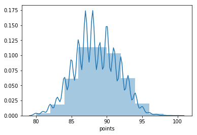
Seaborn simplifies histogram creation with the distplot method. By passing the desired column, occurrences are calculated automatically. The number of bins and the inclusion of a Gaussian kernel density estimate can be optionally specified:
sns.distplot(wine_reviews['points'], bins=10, kde=False)
Including a kernel density estimate for a smoother curve can be achieved as follows:
sns.distplot(wine_reviews['points'], bins=10, kde=True)
Bar chart
Seaborn's countplot method simplifies the creation of bar charts. By passing the desired data, the occurrences of each category are automatically counted:
sns.countplot(wine_reviews['points'])

Seaborn provides an intuitive approach to visualizing categorical data with its straightforward countplot method.
Advanced Data Visualization
Till now we've covered the basics of Matplotlib, Pandas Visualization, and Seaborn syntax, let's explore a few other graph types that offer valuable insights. Seaborn, with its high-level interface for creating aesthetically pleasing graphs, is particularly favored for its simplicity and elegance.
Box plots
Box plots, generated using Seaborn's sns.boxplot method, provide a graphical representation of the five-number summary.
In the example below, a box plot is created for wines with scores greater than or equal to 95 and prices less than 1000:
df=wine_reviews[(wine_reviews['points']>=95) & (wine_reviews['price']<1000)]
sns.boxplot('points', 'price', data=df)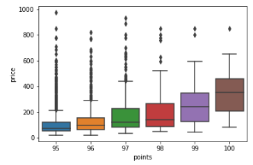
Box plots are advantageous for datasets with a few categories but can become cluttered with too many categories.
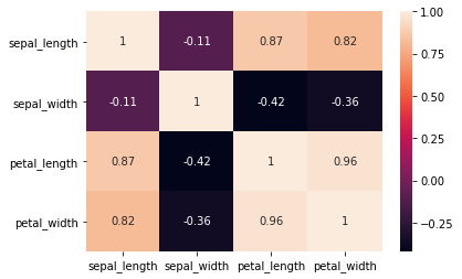
Heatmap
A heatmap is a visual representation of data where values in a matrix are depicted using colors. Seaborn simplifies heatmap creation, especially when exploring feature correlations in a dataset. The correlation matrix, obtained with <dataset>.corr(), serves as the basis for the heatmap.
In Matplotlib, a heatmap without annotations can be created as follows:
import numpy as np

# get correlation matrix
corr=iris.corr()
fig, ax=plt.subplots()

# create heatmap
im=ax.imshow(corr.values)

# set labels
ax.set_xticks(np.arange(len(corr.columns)))
ax.set_yticks(np.arange(len(corr.columns)))
ax.set_xticklabels(corr.columns)
ax.set_yticklabels(corr.columns)

# Rotate the tick labels and set their alignment.
plt.setp(ax.get_xticklabels(), rotation=45, ha="right",rotation_mode="anchor")

To add annotations, two for-loops are necessary:
# get correlation matrix
corr=iris.corr()
fig, ax=plt.subplots()

# create heatmap
im=ax.imshow(corr.values)

# set labels
ax.set_xticks(np.arange(len(corr.columns)))
ax.set_yticks(np.arange(len(corr.columns)))
ax.set_xticklabels(corr.columns)
ax.set_yticklabels(corr.columns)

# Rotate the tick labels and set their alignment.
plt.setp(ax.get_xticklabels(), rotation=45, ha="right",rotation_mode="anchor")

# Loop over data dimensions and create text annotations.
foriinrange(len(corr.columns)):
forjinrange(len(corr.columns)):
text=ax.text(j, i, np.around(corr.iloc[i, j], decimals=2),
        ha="center", va="center", color="black")
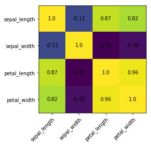
Seaborn simplifies the process significantly:
sns.heatmap(iris.corr(), annot=True)
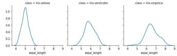
Faceting
Faceting involves breaking data variables into multiple subplots and combining them into a single figure. Seaborn's FacetGrid facilitates faceting, making it helpful for quick dataset exploration.
The example below uses faceting to create kernel density estimate plots for sepal length based on Iris class:
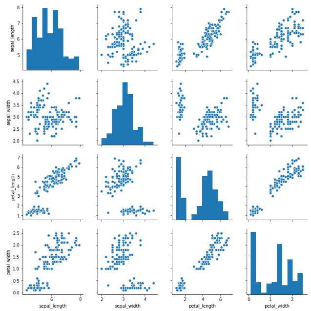
Pairplot
Seaborn's pairplot and Pandas' scatter_matrix enable the visualization of pairwise relationships in a dataset. A pairplot, for instance, displays scatter plots of two features against each other and histograms on the diagonal. The code snippet below illustrates a pairplot:
sns.pairplot(iris)
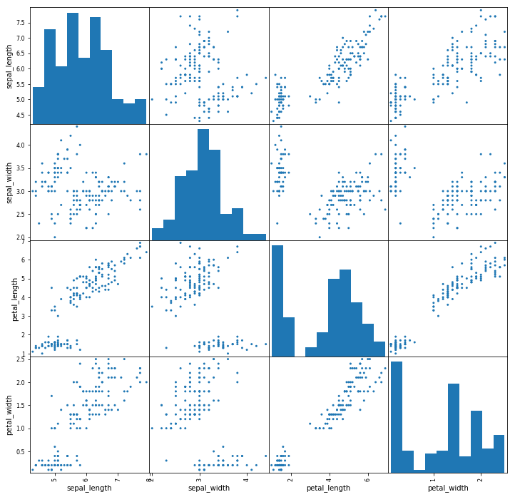
For a scatter matrix using Pandas:
from pandas.plotting import scatter_matrix

fig, ax=plt.subplots(figsize=(12,12))
scatter_matrix(iris, alpha=1, ax=ax)
4. ggplot - https://www.thetechplatform.com/post/ggplot
Conclusion
Data visualization is a crucial discipline for understanding data by revealing patterns, trends, and correlations that may go unnoticed in raw data. Python provides multiple powerful graphing libraries, including Matplotlib, Pandas Visualization, and Seaborn, each offering unique features. In this article, we explored these libraries to enhance our ability to visually interpret and analyze data.


Comments