
Glowing Text in CSS
- Sofia Sondh

- Feb 21, 2023
- 2 min read
Creating glowing text in CSS is a great way to add a visual effect to your website or web application. Here is an example of how to create a glowing text effect using CSS:
Example code 1:
<!DOCTYPE html>
<html>
<title>Online CSS Editor</title>
<head>
<style>
/* Define the styles for the text */
h1 {
  font-size: 3rem;
  text-align: center;
  margin-top: 50px;
  color: Red;
  text-shadow: 0 0 20px Pink;
}

/* Define the keyframes for the animation */
@keyframes glowing {
  0% {
    text-shadow: 0 0 10px Green;
  }
  50% {
    text-shadow: 0 0 20px Yellow;
  }
  100% {
    text-shadow: 0 0 10px blue;
  }
}

/* Apply the animation to the text */
h1 {
  animation: glowing 2s ease-in-out infinite;
}
</style>
</head>
<body>
<h1>Glowing Effect</h1>
</body>
</html>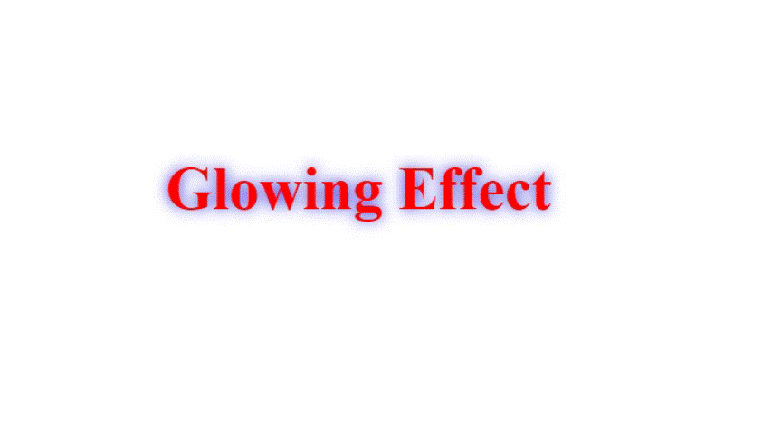
In this example, we use an HTML <h1> element to display the text. We set the font size to 3rem, and center the text using text-align: center. We also add a margin-top of 50px to separate the text from the top of the page.
Next, we define the styles for the text using color and text-shadow properties. We set the text color to Red and apply a text shadow with a Pink color and a 20-pixel blur radius. This creates a soft glow effect around the text.
Then, we define the keyframes for the animation using the @keyframes rule. The animation is named glowing and has three different text shadow values at different percentages. These values create the illusion of the text pulsating and glowing in place.
Finally, we apply the animation to the text using the animation property. The animation name is glowing, and the duration is set to 2s with an ease-in-out timing function. We also set the infinite value for the animation iteration count, so that the animation continues to repeat indefinitely.
When we open the HTML file in a web browser, we will see the text pulsating and glowing with the animation. By changing the values in the keyframes rule, we can adjust the intensity and timing of the animation to suit our design needs.
Example code 2:
<!DOCTYPE html>
<html>
<title>Online CSS Editor</title>
<head>
<style>
h1 {
  font-size: 3rem;
  background: linear-gradient(to right, Green, Red);
  -webkit-background-clip: text;
  -webkit-text-fill-color: transparent;
  animation: glowing 2s ease-in-out infinite;
}

@keyframes glowing {
  0% {
    text-shadow: 0 0 10px Green;
  }
  50% {
    text-shadow: 0 0 20px Red;
  }
  100% {
    text-shadow: 0 0 10px Blue;
  }
}
</style>
</head>
<body>
<h1>Glowing Effect</h1>
</body>
</html>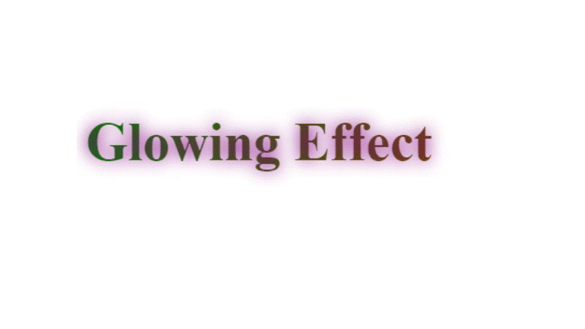
In this example, we use a CSS gradient to fill the text with a colorful glow. We set the background property to a linear gradient that transitions from Green to Red. We then set the -webkit-background-clip property to "text" and -webkit-text-fill-color to "transparent". This causes the gradient to only show up where the text is visible. Finally, we apply the same glowing animation as in the previous example to make the gradient pulsate and glow.


Comments