
Create Radio Buttons and Checkboxes with Fluent UI React in SharePoint Framework
- Manpreet Singh

- Feb 28, 2022
- 6 min read
In this tutorial, we will walk through the process of creating an SPFx web part. We will incorporate the Fluent UI choice group and Fluent UI react checkbox controls into our web part. Finally, we will demonstrate how to save the values to a SharePoint Online list using PnP.
Fluent UI Choice Group and Fluent UI Checkbox are components provided by Microsoft’s Fluent UI library, which is used to build user interfaces in a variety of Microsoft products.
Fluent UI Choice Group: The Choice Group component, also known as radio buttons, lets users select one option from two or more choices. Each option is represented by one ChoiceGroup button; a user can select only one ChoiceGroup in a button group. In Fluent UI v9, ChoiceGroup is replaced with RadioGroup.
Fluent UI Checkbox: The Checkbox component allows users to select one or more items from a group, or switch between two mutually exclusive options (checked or unchecked). It provides a way for users to make selections and toggle settings on or off.
Both components are part of the Fluent UI React library and can be used in SharePoint Framework (SPFx) web parts for SharePoint Online. They are designed to fit seamlessly into Microsoft 365.
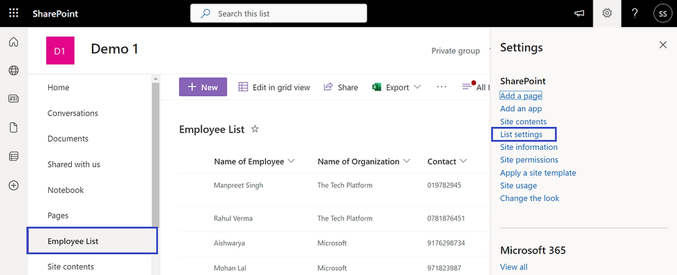
Let’s start by creating a SharePoint list. To do this, navigate to “Site Columns => + New => List”.

Next, we need to add the following columns to our list:
Title
Single Value Checkbox
Multi-Value Checkbox
To add a column to the SharePoint List, click on “+ Add Columns”. Enter the name of the column, select the type as “Choice”, and then click “Save”.


Your list should now look something like this:

Create Radio Buttons and Checkboxes with Fluent UI React in SharePoint Framework
To create an SPFx web part example with Fluent UI ChoiceGroup and Fluent UI Checkbox, follow these steps:
Setting Up the Development Environment:
Open the Node.js command prompt.
Create a new directory for the project:
md fluentuichoicedmo
cd fluentuichoicedmo
Initialize the SPFx project:
yo @microsoft/sharepointSolution name: Enter
Baseline packages: Choose SharePoint Online only (latest)
File location: Use the current folder
Tenant admin deployment choice: N
Permissions for web APIs: N
Type of component: WebPart
Web part name: FluentUIChoiceDemo
Description: Enter
Framework: Choose React
Installing Dependencies:
Install Fluent UI React Package:
npm install @fluentui/reactInstall PnP package for SharePoint interactions:
npm i @pnp/spOnce you've completed these steps, you'll have set up your SPFx project with the necessary dependencies to integrate Fluent UI components and interact with SharePoint using PnP.
Setting Up Web Part Properties:
STEP 1: Define Interface in IFluentUiChoiceDemoProps.ts
In the IFluentUiChoiceDemoProps.ts file, define the interface IFluentUiChoiceDemoProps with a webURL property along with a description property:
export interface IFluentUiChoiceDemoProps {
  description: string;
  webURL:string;
}
STEP 2: Assign WebURL Property
In FluentUiChoiceDemoWebPart.ts, assign the webURL property the value of the current SharePoint site URL:
webURL:this.context.pageContext.web.absoluteUrlThis ensures that the web part knows the SharePoint site URL it's deployed to.
Implementing React Component (FluentUiChoiceDemo.tsx):
STEP 1: Import Necessary Modules
Modules include Fluent UI components for UI elements like checkboxes and choice groups, as well as PnP.js for SharePoint operations.
import { Guid } from '@microsoft/sp-core-library';
import { sp, Web, IWeb } from "@pnp/sp/presets/all";
import "@pnp/sp/lists";
import "@pnp/sp/items";
import {Checkbox, Label, PrimaryButton, ChoiceGroup, IChoiceGroupOption} from '@fluentui/react';Guid: This module is imported from @microsoft/sp-core-library for generating GUIDs.
sp, Web, IWeb: These modules are imported from @pnp/sp/presets/all for SharePoint operations.
"@pnp/sp/lists" and "@pnp/sp/items": These modules are imported to work with SharePoint lists and items.
Checkbox, Label, PrimaryButton, ChoiceGroup, IChoiceGroupOption: These modules are imported from @fluentui/react for UI components.
STEP 2: Define Interface for Component State
This step defines a TypeScript interface named ICheckboxStates to manage the component's state.
export interface ICheckboxStates
{
  singleValueChoiceGroup:string;
  multiValueCheckbox:any;
  singleValueOptions:any;
  multiValueOptions:any;
}
The interface specifies properties to hold values for single-select choice groups, multi-select checkboxes, and their respective options.
STEP 3: Implement Constructor
Here, a constructor is implemented to initialize the component's state.
constructor(props)
  {
    super(props);
    this.state = {
      singleValueChoiceGroup:"",
      multiValueCheckbox:[],
      singleValueOptions:[],
      multiValueOptions:[]
    };

  }
The constructor sets default values for the state properties defined in the ICheckboxStates interface.
STEP 4: Implement Render Mode
The render() method is implemented to define how the component renders UI elements.
public render(): React.ReactElement<IFluentUiChoiceDemoProps> {
    return (
      <div className={ styles.fluentUiChoiceDemo }>
        <h1>Fluent UI ChoiceGroup & Checkbox</h1>
        <div>
        <Label>Single Select ChoiceGroup</Label>
        <ChoiceGroup onChange={this._onChange} options={this.state.singleValueOptions} />
        </div>
        <div>
        <Label>Multi Select Checkbox</Label>
        {this.state.multiValueOptions.map((item) => {
          return (
            <div style={{margin:"2px",padding:"3px"}}>
              <Checkbox style={{margin:"2px",padding:"3px"}} label={item.label} onChange={this.onCheckboxMultiChecked} />
              </div>
            );
          }
        )}
        </div>
        <br />
          <PrimaryButton onClick={e => this.Save(e)}>Submit</PrimaryButton>
      </div>
    );
  }
JSX elements representing choice groups, checkboxes, labels, and a submit button are returned.
State values are used to populate options for choice groups and checkboxes.
STEP 6: Implement 'componentDidMount' method
The componentDidMount() lifecycle method is implemented to perform actions after the component is mounted.
public async componentDidMount(){
    var singleValue=await this.getCheckboxChoices("SingleValueCheckbox","singlevalue");
   this.setState({singleValueOptions:singleValue});
    var multiValue=await this.getCheckboxChoices("MultiValueCheckbox","multivalue");
   this.setState({multiValueOptions:multiValue});
  }

  public async getCheckboxChoices(fieldname,value) {
    if(value=="singlevalue")
    {
      var singlevaluechoices = [];
    let web = Web(this.props.webURL);
    await web.lists.getByTitle("FluentUICheckbox").fields.getByInternalNameOrTitle(fieldname).select('Choices').get().then((field) => {
      console.log(field);
      for (var i = 0; i < field["Choices"].length; i++) {
        singlevaluechoices.push({
          key: field["Choices"][i],
          text: field["Choices"][i]
        });
      }

    });
     return  singlevaluechoices;
    }
    else if(value=="multivalue")
    {
      var multivaluechoices = [];
    let web = Web(this.props.webURL);
    await web.lists.getByTitle("FluentUICheckbox").fields.getByInternalNameOrTitle(fieldname).select('Choices').get().then((field) => {
      console.log(field);
      for (var i = 0; i < field["Choices"].length; i++) {
        multivaluechoices.push({
          label: field["Choices"][i]
        });
      }
    });
     return  multivaluechoices;
    }
  }
In this case, it fetches choice options from SharePoint lists and updates the component's state accordingly.
STEP 7: Implement Event Handlers
Event handlers such as _onChange and onCheckboxMultiChecked are implemented to handle user interactions.
public _onChange = async (ev: React.FormEvent<HTMLInputElement>, option: IChoiceGroupOption): Promise<void> => {
    console.log(option);
    this.setState({ singleValueChoiceGroup: option.key });
  }

  public onCheckboxMultiChecked = async (ev: React.FormEvent<HTMLElement>, isChecked: boolean): Promise<void> => {
    if (arr.indexOf(ev.currentTarget["ariaLabel"]) !== -1) {
      arr.splice(arr.indexOf(ev.currentTarget["ariaLabel"]), 1);
    }
    else {
      await arr.push(ev.currentTarget["ariaLabel"]);
    }
    await this.setState({ multiValueCheckbox: arr });
}_onChange: This method handles changes in the choice group and updates the singleValueChoiceGroup state.
onCheckboxMultiChecked: This method handles changes in the multi-select checkboxes and updates the multiValueCheckbox state.
In case you missed - Checking the Existence of SharePoint List using the TryGetList Method
STEP 8: Implement Save Method
The Save() method is implemented to handle saving selected values to the SharePoint list when the user clicks the submit button.
private async Save(e) {
    let web = Web(this.props.webURL);
    await web.lists.getByTitle("FluentUICheckbox").items.add({
      Title: Guid.newGuid().toString(),
      SingleValueCheckbox: this.state.singleValueChoiceGroup,
      MultiValueCheckbox: { results: this.state.multiValueCheckbox }

    }).then(i => {
      console.log(i);
    });
    alert("Submitted Successfully");
  }
It utilizes PnP.js to interact with SharePoint lists and add new items containing the selected values..
The complete code looks like below: (FluentUiChoiceDemo.tsx)
import * as React from 'react';
import styles from './FluentUiChoiceDemo.module.scss';
import { IFluentUiChoiceDemoProps } from './IFluentUiChoiceDemoProps';
import { escape } from '@microsoft/sp-lodash-subset';
import { Guid } from '@microsoft/sp-core-library';
import { sp, Web, IWeb } from "@pnp/sp/presets/all";
import "@pnp/sp/lists";
import "@pnp/sp/items";
import {Checkbox, Label, PrimaryButton, ChoiceGroup, IChoiceGroupOption} from '@fluentui/react';

var arr = [];
export interface ICheckboxStates
{
  singleValueChoiceGroup:string;
  multiValueCheckbox:any;
  singleValueOptions:any;
  multiValueOptions:any;
}

export default class FluentUiChoiceDemo extends React.Component<IFluentUiChoiceDemoProps, ICheckboxStates> {
  constructor(props)
  {
    super(props);
    this.state = {
      singleValueChoiceGroup:"",
      multiValueCheckbox:[],
      singleValueOptions:[],
      multiValueOptions:[]
    };

  }
  public async componentDidMount(){
    var singleValue=await this.getCheckboxChoices("SingleValueCheckbox","singlevalue");
   this.setState({singleValueOptions:singleValue});
    var multiValue=await this.getCheckboxChoices("MultiValueCheckbox","multivalue");
   this.setState({multiValueOptions:multiValue});
  }

  public async getCheckboxChoices(fieldname,value) {
    if(value=="singlevalue")
    {
      var singlevaluechoices = [];
    let web = Web(this.props.webURL);
    await web.lists.getByTitle("FluentUICheckbox").fields.getByInternalNameOrTitle(fieldname).select('Choices').get().then((field) => {
      console.log(field);
      for (var i = 0; i < field["Choices"].length; i++) {
        singlevaluechoices.push({
          key: field["Choices"][i],
          text: field["Choices"][i]
        });
      }

    });
     return  singlevaluechoices;
    }
    else if(value=="multivalue")
    {
      var multivaluechoices = [];
    let web = Web(this.props.webURL);
    await web.lists.getByTitle("FluentUICheckbox").fields.getByInternalNameOrTitle(fieldname).select('Choices').get().then((field) => {
      console.log(field);
      for (var i = 0; i < field["Choices"].length; i++) {
        multivaluechoices.push({
          label: field["Choices"][i]
        });
      }
    });
     return  multivaluechoices;
    }
  }
  public _onChange = async (ev: React.FormEvent<HTMLInputElement>, option: IChoiceGroupOption): Promise<void> => {
    console.log(option);
    this.setState({ singleValueChoiceGroup: option.key });
  }

  public onCheckboxMultiChecked = async (ev: React.FormEvent<HTMLElement>, isChecked: boolean): Promise<void> => {
    if (arr.indexOf(ev.currentTarget["ariaLabel"]) !== -1) {
      arr.splice(arr.indexOf(ev.currentTarget["ariaLabel"]), 1);
    }
    else {
      await arr.push(ev.currentTarget["ariaLabel"]);
    }
    await this.setState({ multiValueCheckbox: arr });
  }

  private async Save(e) {
    let web = Web(this.props.webURL);
    await web.lists.getByTitle("FluentUICheckbox").items.add({
      Title: Guid.newGuid().toString(),
      SingleValueCheckbox: this.state.singleValueChoiceGroup,
      MultiValueCheckbox: { results: this.state.multiValueCheckbox }

    }).then(i => {
      console.log(i);
    });
    alert("Submitted Successfully");
  }

  public render(): React.ReactElement<IFluentUiChoiceDemoProps> {
    return (
      <div className={ styles.fluentUiChoiceDemo }>
        <h1>Fluent UI ChoiceGroup and Checkbox</h1>
        <div>
        <Label>Single Value ChoiceGroup</Label>
        <ChoiceGroup onChange={this._onChange} options={this.state.singleValueOptions} />
        </div>
        <div>
        <Label>Multi Value Checkbox</Label>
        {this.state.multiValueOptions.map((item) => {
          return (
            <div style={{margin:"2px",padding:"3px"}}>
              <Checkbox style={{margin:"2px",padding:"3px"}} label={item.label} onChange={this.onCheckboxMultiChecked} />
              </div>
            );
          }
        )}
        </div>
        <br />
          <PrimaryButton onClick={e => this.Save(e)}>Submit</PrimaryButton>
      </div>
    );
  }
}
Now, it is time to run the below command and start the local workbench.
gulp serveTroubleshooting
If you get an error, Error TS2307: Cannot find module ‘@fluentui/react’ while running the gulp serve command, then run the below command to fix the error:
npm install @fluentui/reactYou can see like below:

Error TS2307: Cannot find module ‘@fluentui/react’
You can install using yarn like below:
yarn add @fluentui/reactOnce you run the above npm cmdlets the error Error TS2307: Cannot find module ‘@fluentui/react’ will not come.
Conclusion
By following this tutorial, you've learned how to create an SPFx web part using Fluent UI controls like ChoiceGroup and Checkbox, integrate SharePoint interactions using PnP, and deploy the web part for production use. This provides a foundation for building interactive and user-friendly SharePoint solutions.


Savor a new level of adventure and create some different memories with our Cheap Escorts who provide affordable and alluring experiences with gorgeous women. Abhay Khand Escorts Service | Indirapuram Call Girls | Call Girls in Gaur City | Ahinsa Khand Escorts | Escorts in Ambedkar Road | Anand Lok Escort Service | Crossings Republik Call Girl | Call Girl in Dasna | Daulatpura Escort | Escort in Ghukna |
De nombreux étrangers s’intéressent aujourd’hui au Maroc non seulement pour le tourisme mais aussi pour l’acquisition de biens de prestige, attirés par le climat, la proximité avec l’Europe et la richesse culturelle. Dans ce contexte, le besoin d’un accompagnement professionnel, transparent et capable de comprendre les exigences internationales devient essentiel. Sotheby’s met en avant cette expertise en alliant une connaissance approfondie du marché marocain à une réputation mondiale. C’est cette double compétence qui fait la différence pour sécuriser des transactions souvent complexes.