What Is Google Charts?
- The Tech Platform

- Jan 31, 2020
- 4 min read
So you’ve heard the term Google Charts thrown around a few times and are now curious to what they are. This article informs on exactly what Google Graphs are all about and what they can be used for. I’ll touch on a few key points, facts and issues with this super-epic and renown charting library. Before you read on, take a look at the image above, take in the beauty and breath. It speaks a thousand words, and in a snapshot, you will probably know exactly what this article is about.
Contents
What on earth is Google Charts
In a nutshell, Google Charts enable Data Visualizations (Charts/Graphs) to be displayed on a web site. These charts can be powered with static data or can be fed data from a database.
In technical terms, these charts are an intelligent JavaScript library that packs a range of beautiful charts, ready to be powered by data. If you don’t know what JavaScript is, then check out this article here written by Mozilla.org. Ok, so if you already know what JavaScript is, then you will already be on the same wave-length. The Google charting package provides an ‘API’ to inject its library into your HTML, kind of like a Content Delivery Network call.
The JavaScript API renders a graph onto an SVG Canvas with absolutely pixel-perfect results on your web-page. Because of the nature of SVG’s they visually look high-definition when compared to image-based graphs.
These charts are an exciting alternative to some premium paid to chart libraries around the world. With a giant and informative documentation-base ready to be ingested with your brain.
What type of Charts comes with this library?
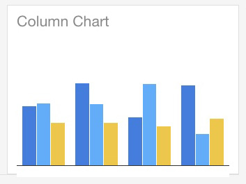
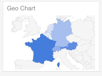
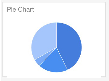
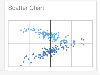
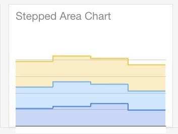
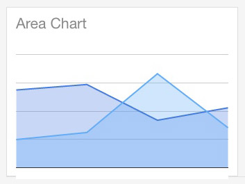
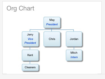
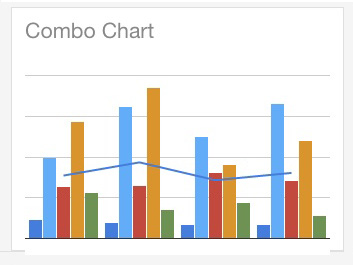
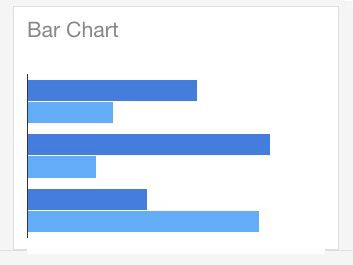
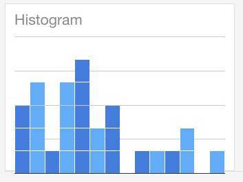
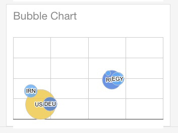
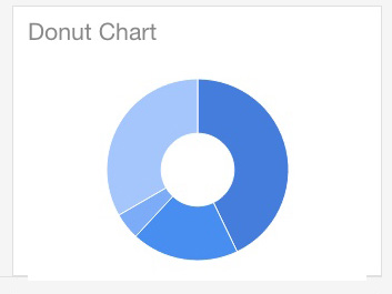
The question is, what chart’s don’t come with this library! This package boasts seventeen different chart-types. Each with meaningful uses of their own. You can expect to see general every-day charts but there are some really advanced-style charts. For example, an organization chart. Each of the charts is listed below with a picture example of each one.
Column
Map/Geo
Scatter
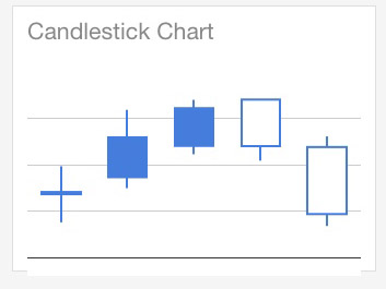
CandleStick
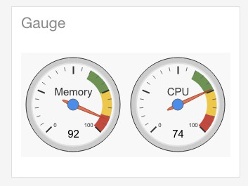
Gauge
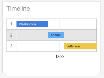
Timeline
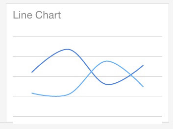
Line
Stepped Area
Area
Tree map
Organization
Combo
Horizontal bar
Histogram
Bubble
Donut
Are google charts free?
Yes, these incredibly good looking visualizations are completely free to use for personal, commercial and educational use. But this shouldn’t be mistaken with being open-sourced, because they are definitely not. Although there is one rule you must adhere to before using the API. You must agree to be bound by Google’s API Terms Of Services, which can be viewed here.
The terms of services are nothing much to worry about but, they do put a bold statement on protecting your user’s data though, which should already be a number one priority for every webmaster anyway.
How do I use them?
Google has already made using this API the easiest process in the world. All you need to get started is a text editor, an HTML file and an internet connection. After you’ve got these in place, you simply make a call to their API within your HTML file’s <head> tag. See the code sample below
<script type="text/javascript" src="https://www.gstatic.com/charts/loader.js"></script>Alternatively, for the most effective head-start, you can copy and paste their quick-start example available on the Google developers website. See this link to grab the code for the working example. If you use this example code, your page will be loaded with a Google Pie Chart with some example data. It’s really easy to get set up!
How it works
When you see the methodology of how requests work to the API, you will think it’s really simple. Although, what goes on within the API is most likely some really crazy magic.
In simple steps, this is how it works –
HTML file loaded with JavaScript code that you have specifically set for the chart’s you need.
JavaScript executes the AJAX request to the API.
The API then turns your data and settings into an SVG.
The API sends back the SVG.
HTML file renders the canvas to the page.
See the image below for a visual example
Real-world Use-cases
So, what can google charts be used for? This is a question that has a million answers depending on a couple of things.
Your imagination
Business Needs
Teaching/Educational requirements
Here are a few example use cases that these charts could come in really handy for.
1. Stock-exchange
Candlestick graphs would be perfectly suited to show losses and gains against certain stock markets.
2. Manufacturing Dashboards
When linked to real-time data, Gauge Visualizations could be extremely effective for visualizations of data.
3. Financial Reporting
Many of the API’s charts could be used to provide a snapshot of cash-flow data across a management dashboard.
4. Public Statistical Reporting
Geo or Map visualizations could be used to provide visibility for certain key point indicators across the globe.
5. Website Statistical Reporting
Again another broad range of graphs could be used to graph out your website visitors and what they do within your website.
The iDataLabs statistical website reports that the top three industries that are currently using this Google API are computer software, information and technology services, and higher education. You can see this report on the following link.
Drawbacks
This drawback is probably already ticking away in your mind. Is my data safe and is it stored? The answer to both of these is yes. Google is number one when it comes to data security and you can be assured that the team at Google make it their number one priority for data protection. Secondly, Google has released an FAQ stating that they store data for 2 weeks only for testing purposes.
The only other drawback to this library is that they can only be used online. If you were to take your project offline, the API wouldn’t be able to be called. Therefore, no requests would be sent and no graph would be returned. I can only imagine this drawback being a pain in a very small majority of cases, though.
Summary
Considering this library API is completely free to use, it’s an amazing tool to have in your arsenal. Some paid libraries for data visualizations can cost tens-of-thousands for commercial industries. One thing, in my opinion, that Google always has the edge of other alternatives is that they are simply the king’s when it comes to data protection and security. Googles charting solutions is the perfect alternative to Excel-based graphs or any other desktop-only based visualization package.
If you’re already using this API, I would love to know about it, as I would like to list more real-world use cases as it really does a show of its incredible power. Hope you enjoyed reading.
SOURCE: Paper.li




















Comments