
Visualising spending behaviour through open banking and GIS
- The Tech Platform

- Jan 30, 2020
- 8 min read


Financial habits have historically been something that people place back of mind, but with the rising amount of information and tools available, a new attitude to financial control is creating a rising popularity in transparent, digital banking. A new breed of financial institutions (such as Monzo, Starling, Revolut and N26) are leveraging digital products to enable their customers to have greater access and control of their spending. They achieve this by offering modern mobile applications, real-time notifications, better security, and developer APIs that allow previously inaccessible to be available for analysis and productisation by anyone with an idea.
Technology has also aided human behaviour in other ways. When people think about an event or memory they often refer to where it occurred. When trying to find a photo on a phone it’s often easier to describe where it occurred rather than the date it was taken e.g. “We were in Spain” or “it was at my home in Greenwich”. The same human behaviours can be applied to financial decisions and spending. A statement reading “-£82.00 at XDB Goods” doesn’t help explain the story and decisions behind the transaction, leaving people confused and desperately trying to think of what it could be.
I’m interested in exploring the representation of financial transactions on a map to help answer questions about where spending occurs and trigger memories about places visited. This map combined with other data layers can also be used to recognise and identify historic spending habits, find new places to visit, or even identify fraudulent and unusual transactions through location.
Data size and scope
For this experiment, I used Monzo, who provide a very comprehensive API to extract information about users on their platform. Collecting this data requires very explicit consent to gather and store the data, so for this exercise I have only used my own data although it is possible to build a scalable application and analyse the data from other users with their permission.
The dataset contains every transaction on my personal current account for the last 3 years, at just over 5000 records. The data is formatted as JSON and structured as an array of objects with each transaction containing the timestamp, amount as an integer of pence/cents, currency, description, category, notes, attachments (such as receipts), metadata, information about settlement, and merchant information. The merchant information contains the name, co-ordinates, address, Google Places ID, country and an approximate flag (to mark when a merchant location is estimated).
Initial analysis
The dataset presented an exciting opportunity to find and analyse more about my spending habits and also better understand the capabilities of the Monzo API. I created a JavaScript program to parse through the transactions and do some very basic topical categorisation.
In the dataset I found about 1/3 of the transactions were spent on eating out and 1/3 of those just on coffee. Cafés represented over 400+ transactions but overall was a relatively low spend, averaging just over £3.5 each visit. The largest transaction by amount were work expenses, the most expensive personal purchases being shopping, and an extreme outlier at almost 5x the next highest transaction amount on pre-paid flight lessons for a pilot licence I completed last year. The majority of transactions occur in London but they spread across 5 continents with the most isolated transactions occurring in Hobart, Tasmania.

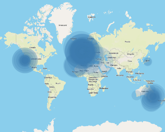
The total amount of money moving through the account over the three-year period came to a staggering ~£200k (which includes business expenses and transfers to other banks) and ~£90k including only personal expenses. Monzo isn’t my only bank and the stark difference between these numbers is illustrative of the complications of using the data raw to draw meaningful conclusions. Business expenses are not indicative of personal financial habits and could very easily skew the visualisation; to ensure Figure 1: All global transactions weighted by amount an accurate and informative map the data requires sanitisation.
Initial experiments
To get an understanding of what could be possible using this dataset and also understand the limitations and opportunities that the mapping software QGIS could offer I loaded in a base map from MapBox and imported all 5000 transactions.
The software was slow to render and the points were all overlapping. Even when allocating the transactions different colours for each category, the map wasn’t useful or easy to draw anything meaningful from. Having too much information meant items were overlapping and didn’t present the useful conclusions as I had initially hoped.


Presenting the transaction this way did let me find interesting outliers and complications with the dataset that I wouldn’t have noticed without doing this experiment. Online purchases were particularly problematic with location (for example, AWS shows as the geographical centre of the USA). This was also true for merchants where Google didn’t know their physical address and placed the merchant in the geographical centre of the country.
The default centre of London is Trafalgar Square, where there are no shops so it’s safe to say these
merchant locations are inaccurate.
Figure 2: All transactions layered on a base map with equal weighting
Sanitising the dataset
I modified the JavaScript application to iterate over the transactions and perform some filtering and normalising. Firstly, any transaction categorised as Expenses, Bills, Finances, and Deposits would be removed leaving only personal expenses. I also removed any transactions where the merchant didn’t exist or where there wasn’t geo-information available. I also renamed some of the keys to make the data easier to work with in and flattened the JSON structure to make it easier to convert to CSV. This created a file containing only transactions that occurred in a physical merchant and that were not business expenses called `Monzo Sanitised Transactions`.


Figure 3: The node app iterates over the dataset and writes a CSV file containing the location data
To make the data even easier to experiment with I also created a subset of the data containing only eating out transactions (called `Monzo Eating Out`). This smaller dataset resolved some of the performance issues I was facing with QGIS.
I wanted to reflect the value of the transaction in the visualisation using the size parameter of the map marker. Another problem I faced was that all the transaction amounts were mostly negative (as these represent transactions where money is leaving the account). The mapping software QGIS requires a positive integer scale, so I modified the amount value by adjusting the sanitising formula to multiply the transaction amount by -1. One consequence this had is now refunds have a negative value; to solve this, I limited the minimum represented value to zero ensuring only debited transactions are shown.


Figure 4: Eating out transactions individually represented in Soho, London
I had a concern that using individual transactions didn’t represent the aggregated total sum and count for each merchant (which would be statistically more significant) and eliminate the problem of points stacking on-top of each other. I created a new function in the JavaScript app to sanitise the data based on unique merchant IDs then create a sum and count of transactions for each merchant.
While this function correctly reduced the data where the merchant IDs matched, this method wasn’t perfect as the merchant data is crowdsourced and often the same store didn’t share the same ID.


Figure 5: Eating out transactions in London individually sized by amount


Figure 6: Eating out transactions in London aggregated by merchant and sized by amount
When the aggregated data was imported onto the map the results were interesting as it was almost impossible to understand or see differences from the individual visualisation. The extreme purchases were far outliers making it difficult to see the difference in spending between smaller amounts (both value and count). Even applying a transformation curve to this dataset, the visualisation still wasn’t as compelling as the individual transactions so I abandoned this approach and focused on other ways to visualise the information more effectively.
Map layers
I initially used MapBox studio to create a customised base-layer that is served over the web in vector format. MapBox is great as an alternate to Google maps as it can be styled and customised for use in application development. The issue with using street maps for data visualisation is the map was very visually complicated. There were a lot of colours and labels that distracted from the interesting data layered on top.
I explored some other map visual styles and took inspiration from wildlife maps that use very simple lines and shading to show area boundaries and significant locations. Removing all the layers that are used for way-finding places more significance on the merchant locations and it is easier to interpret.
For these lines I chose the borough and ward boundaries for London Counties. These shape files are conveniently available on the UK Government’s open database (data.gov.uk) which publishes open data gathered by its departments and has the 2018 boundary survey available as vector shapefiles.
Transforming co-ordinate reference systems
An issue I noticed immediately when using the government base map is that the datasets were not in the same coordinate reference system and the map presented itself skewed. The data was produced by the UK government using the local system [OSGB36] where as Monzo uses the global digital standard [WGS84]. I adjusted the data layer to use the base-layer’s CRS.
The finished map


Figure 7: Map created using the sanitised data and base layers
The final map layers 5 spending categories and normalises the amounts so the size of the markers represent the value spent.
Each category represented by colour and has an opacity so more frequent transactions have a richer colour. There are clear clusters around points of interest (home/work), the rail network, and some interesting outliers.
The biggest cluster comes as no surprise, eating out has a huge number of transactions layered on-top of each other in central London which from the initial analysis was about 1/3 of total transaction numbers. Not so coincidently, the three clusters of green are nearby the three locations that I’ve worked (Shoreditch, Farringdon, and Soho). It’s easy to conclude that I spend a lot on eating out near work and in the city in general.
The map also shows a lot of whitespace where there aren’t any transactions. It shows how little time I’ve spent in west London over the last 3 years and could be a good opportunity to try more restaurants and shops in that area. Combining this information with a hit-list could be a great way to explore and check-off places in London and around the world.
This visualisation could also be a good way to curb spending habits by tracking these categories over time and gamifying the objective to replace eating out with groceries or reducing the overall number to help with saving money.
Further development
Presenting the merchant data this way to end users could be a great way for Monzo or Google to validate the merchant locations and further crowdsource feedback on the correct positioning for merchants. I have a hypothesis that people think about where they were/where they paid for something and presenting transactions in this way allows for interrogation of outliers where people question the transaction. It could even help find fraudulent transactions or reduce false-flagged fraud by providing the much-needed context around where a transaction occurred.
I found in my dataset a transaction in Turkey, a country I have never visited but where an online merchant was registered. I also saw an abnormally high transaction volume in north London for coffee, where I rarely visit, but where the merchant head office is. These examples indicate how people that are familiar with their own habits can contribute back to the dataset and help create a richer and more accurate representation of merchant locations.
Business and Government could hugely benefit from understanding the location of these categories to help inform: council zoning, price setting/adjustment for businesses, targeting “high volume” streets or routes, help individuals manage their spending, or even as a product to help find popular restaurants, attractions or housing near amenities.
This task proved incredibly thought provoking and opened up a new way of thinking about behavioural spending. In future versions I would be interested to continue this experiment with a larger pool of users to compare spending between people. It would also be interesting to explore how other parameters such as day of the week impact changes and patterns of consumer spending.


Eating out locations by amount (pink) and frequency (blue)
SOURCE:Paper.li


Comments