Use CSS Variables instead of React Context
- The Tech Platform

- Dec 19, 2020
- 5 min read
I've been riding the CSS-in-JS train for years (I was even a significant contributor to the "movement"). It's awesome. I've never been so productive working with CSS than when I added a real programming language to it.
I'm still a fan of CSS-in-JS, and in recent years, the CSS spec has evolved and improved a lot and modern browsers have too (unfortunately, Internet Explorer is NOT a modern browser in this or any context). Often I'd use a ThemeProvider (like those found in emotion), but turns out there aren't a whole lot of advantages to that kind of component for many use cases and there are several disadvantages.
Let's look at a simple example of "Dark Mode" and compare differences in API (developer experience) and performance (user experience). We'll keep the example simple, and in both the before/after, we'll be using emotion's styled utility. Keep in mind that with the ThemeProvider you can consume the values using the useTheme hook, with a styled component, or with the css prop. With CSS Variables, you can get the values in your CSS with var(--css-variable-name) and in your JavaScript using getComputedStyle(element).getPropertyValue('--css-variable-name') (which you really don't need to do...)
Ok, let's look at some code. Here's an approach to using emotion's ThemeProvider:
import * as React from 'react'
import styled from '@emotion/styled'
import {ThemeProvider} from 'emotion-theming'

const themes = {
  light: {
    colors: {
      primary: 'deeppink',
      background: 'white',
    },
  },
  dark: {
    colors: {
      primary: 'lightpink',
      background: 'black',
    },
  },
}

const PrimaryText = styled.div(({theme}) => ({
  padding: 20,
  color: theme.colors.primary,
  backgroundColor: theme.colors.background,
}))

function ThemeToggler({theme, onClick}) {
  const nextTheme = theme === 'light' ? 'dark' : 'light'

  return (
    <button onClick={() => onClick(nextTheme)}>
      Change to {nextTheme} mode
    </button>
  )
}

function App() {
  const [theme, setTheme] = React.useState('light')
  return (
    <ThemeProvider theme={themes[theme]}>
      <PrimaryText>This text is the primary color</PrimaryText>
      <ThemeToggler
        theme={theme}
        onClick={(nextTheme) => setTheme(nextTheme)}
      />
    </ThemeProvider>
  )
}

export default App
What's cool about this is it's "just JavaScript" so you get all the benefits of variables etc. But we're not really doing all that much with this other than passing it around through the ThemeProvider. (To be clear, the way the ThemeProvider works is it uses React's Context API to make the theme accessible to all emotion components without having to pass props all over the place).
Let's compare this with the CSS Variables approach. But before we get to that, I need to mention that there's no "ThemeProvider" for this. Instead, we define the variables in regular CSS that will get applied based on a data attribute we apply to the body. So here's that css file:
body[data-theme='light'] {
  --colors-primary: deeppink;
  --colors-background: white;
}

body[data-theme='dark'] {
  --colors-primary: lightpink;
  --colors-background: black;
}
Alright, so with that, here's the implementation of the exact same UI:
import * as React from 'react'
import './css-vars.css'
import styled from '@emotion/styled'

const PrimaryText = styled.div({
  padding: 20,
  color: 'var(--colors-primary)',
  backgroundColor: 'var(--colors-background)',
})

function ThemeToggler() {
  const [theme, setTheme] = React.useState('light')
  const nextTheme = theme === 'light' ? 'dark' : 'light'

  React.useEffect(() => {
    document.body.dataset.theme = theme
  }, [theme])

  return (
    <button onClick={() => setTheme(nextTheme)}>
      Change to {nextTheme} mode
    </button>
  )
}

function App() {
  return (
    <div>
      <PrimaryText>This text is the primary color</PrimaryText>
      <ThemeToggler />
    </div>
  )
}

export default App
Let's first compare what it's like to use these values:
// ThemeProvider:
const PrimaryText = styled.div(({theme}) => ({
  padding: 20,
  color: theme.colors.primary,
  backgroundColor: theme.colors.background,
}))

// CSS Variables:
const PrimaryText = styled.div({
  padding: 20,
  color: 'var(--colors-primary)',
  backgroundColor: 'var(--colors-background)',
})
There's not really much of a difference from a DX (development experience) standpoint here. One point for the CSS Variables approach is not having to create a function that accepts the theme and returning styles (and no need to even learn about that API).
One point for the ThemeProvider approach is if you're using TypeScript you could get type safety on your theme... But ummm... Check this out:
// src/theme.js
const theme = {
  colors: {
    primary: 'var(--colors-primary)',
    background: 'var(--colors-background)',
  },
}
export {theme}

// anywhere-else.js
import {theme} from 'theme'

const PrimaryText = styled.div({
  padding: 20,
  color: theme.colors.primary,
  backgroundColor: theme.colors.background,
})
BOOM. Static typing-friendly.
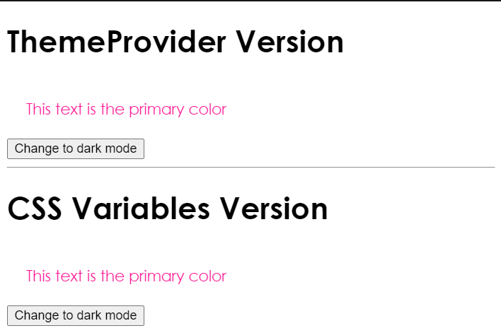
Either way, that's really the only significant DX difference. Let's consider the UX (user experience) difference. Why don't you play around with it:
import * as React from 'react'
import ReactDOM from 'react-dom'

import ThemeProviderApp from './theme-provider'
import CSSVarsApp from './css-vars'
import BothApp from './both'

function App() {
 return (
 <div>
      <div>
        <h1>ThemeProvider Version</h1>
        <ThemeProviderApp />
      </div>
      <hr />
      <div>
        <h1>CSS Variables Version</h1>
        <CSSVarsApp />
      </div>
      <hr />
      <div>
        <h1>Both</h1>
        <BothApp />
      </div>
    </div>
 )
}

ReactDOM.render(<App />, document.getElementById('root'))
You'll notice there's not really any observable UX difference, and there's not for this simple example. But why don't you try this with me:
pop open the React DevTools Profiler
Start a profiling session (click the little circle)
Click the toggle button for each
Stop the profiling session
Compare the two commits
Here's what I see:
ThemeProvider:
CSS Variables:
I don't want you to get hung up on the number of milliseconds to rerender. This isn't a controlled benchmark (we're in React's dev mode for one thing). The thing I want you to consider is how many components needed to re-render for this change. Let's consider the ThemeProvider approach first. The main reason for this is the way we've structured our state (we could restructure things and improve it a little bit). But even if we restructured things, when the theme changes, every emotion component needs to be re-rendered to account for the theme change.
Turning to the CSS Variables approach, you'll notice the only component that re-rendered was our ThemeToggler component responsible for updating the body. And yet the user experience works perfectly! This is the magic behind CSS variables. With the ThemeProvider approach, we have to update the styles of every component, and then the browser paints those updates. But with the CSS Variables approach, we update the styles to a single component (the body) and then the browser paints those updates. The browser paint should theoretically take the same amount of work on the part of the browser, so the only difference is how much work we're making the browser do to have React re-render all our components and get emotion to update the styles of every component.
This can have negative performance implications as your app grows. Considering the DX isn't objectively better or worse either way, but the UX is quite possibly better with CSS Variables, I feel comfortable recommending CSS Variables over using Context to share a theme like this.
Oh, and consider also that CSS Variables are part of the browser spec and the ThemeProvider isn't. That's another solid point for CSS Variables
This is one standard I'd suggest you embrace.
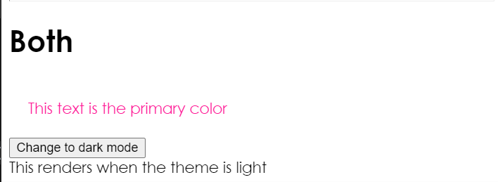
One last piece of nuance here. What if you not only want to change styles but also want to change component implementations based on the theme? In this case... YOU CAN DO BOTH! The benefit of doing this is the only components that need to consume the context value are those that need to render differently based on the theme (which is likely a small subset). Most components can use the css variables for styling purposes only, so you'll still get the aforementioned benefits. If you don't need components to render differently based on the theme then I wouldn't bother with this, but if you do, then it's pretty simple to do. There are several ways to accomplish this, I've done one implementation in the codesandbox. Enjoy exploring that.
CSS variables (custom properties) are awesome. Give them a look. Good luck!
Source: Epic react


Comments