Starbucks Brand Image Methods are Super Effective: follow them to Create your Startup Image
- The Tech Platform

- Jun 16, 2020
- 7 min read
Perfecting your startup image is no easy feat
Let’s get one thing straight. You need to get your startup image right because it is one of the most crucial things you have to get right if you want to succeed. The startup image success formula is to have not only have a great product, but also a great startup image. Even if a lack of branding is not one of the main reasons why startups fail, your startup image genuinely matters, and it will make or break your startup during the first few years. Many entrepreneurs and startups KNOW that their product is great, in fact, their friends and family too, are SURE that their product will succeed. However, the world hasn’t heard about you just yet, and that is a big challenge. In this article, you will get to see how Starbucks Brand Image methods are effective and how you too can have a very successful brand image. Starbucks has a well-calculated brand image given that they work hard and curate carefully the way they look. Today, I am going to take this coffee company example to show you how Starbucks brand image is powerful and how you can replicate their branding to your startup. Researchers at Princeton have found that it takes milliseconds to make the first impression, and most of the time, it is difficult to alter these. So your digital media marketing campaigns have to be well calculated, but before all, you need to carefully curate a great startup image, a stellar impression on people. You need to move them, elicit emotion, desire, hope in order to attract them and get their attention. Your product will change the world, but you need the users believe in you as well. You need their permission to access them, in order to change their lives for the better.
In this article, you will see
A great life example on how one startup perfected their image. How Starbucks brand image works and a close look at the methods they use to perfect the "Starbucks Brand Image".
How you too, with a few simple tactics can perfect your startup image, and convey the right message to the world.
Some of you will think that startup image or your startup image is something you should be dealing after you finish focusing on your product and marketing, not before. I suggest that you come up with a solid foundation about what you would like your startup to look like, and for it to be in line with your product. You can always improve or change the way you are through time, in fact many start-ups do go through a logo remake, but you should always refer to the initial foundation. Good news is, once your startup image is decided on and well established, you will have one less thing to focus on, and can relax and work on growing your amazing startup. Today is your lucky day, because Growth Hackers will guide you along the way to startup image perfection. Rome wasn't built in a day, startup image perfection isn’t either, but with the help of this article, you will get there in no time !
All brands do it, let’s check out a real life example, Starbucks.
Now let’s take a look at Starbucks brand image. You will see how simple their website and social media looks, but if investigated carefully, it is clear that everything put into the website is carefully and meticulously calculated and optimized for customers. They are very self-aware and conscious of what kind of image they want to convey towards their fans. This is a great example, looking at it through this perspective is a lot of fun !
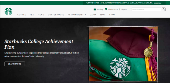
Here’s their webpage at a first glance.
So, here’s their webpage. Notice that they have a certain color palette for this season. You will notice that they regularly update their color palette according to the updates on the webpage. As a startup, you won’t necessarily have to change colors around your website that often, but see how the green is well anchored all around the page, the menu, even the picture has hints of the same shade of green, conveying the message that they are a well established brand and have a consistent image across the website. Now, before moving on to their social media, notice the dark gray backdrop, that is used as a background, and a bit of brown of the table in the image behind the apron. Starbucks is all about coffee, so having a shade of brown that reminds us of what they sell is also important. And green is not haphazardly chosen, by using green (and not blue, or pink or purple or any shade that comes to mind), they want to tell users that they care about the earth, given that they value fair trade and our ecosystem. Regardless of what they do, they are capable of telling and convincing their fans that they are a good and honest company.
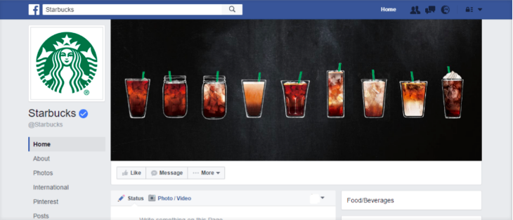
Ok, with those in mind, let’s check out their facebook.
Notice that although facebook’s interface is primarily blue, you can see that Starbucks has made a conscious effort to show that this fan page is their area, and their domain. The cover image has the same shade of gray, and you have the same hints of “the Starbucks green” through the little straws that peak out from the beverages. You have a very similar shade of brown that was barely used on the website as well. Again, the visual anchor is their famous mermaid logo.
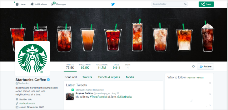
Here’s their Twitter (start seeing a pattern?
Here, the company has used the same shade of green as the primary color for the call to action and other buttons. (You can easily find the same shade of color of your logo and its color code, which you can then use for multiple web elements with the help of a color picker by uploading your picture on Photoshop, or even Paint). Again, you can easily see that their cover picture is basically the same on facebook. The backdrop is gray, and they don’t even have to be too matchy matchy, but even if we removed the word “Starbucks”, or take a step further and remove the logo itself across all platforms, we can see that these pages belong to the very same brand.
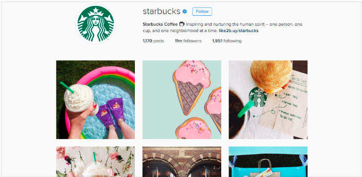
And finally, have a look at their Instagram.
Although on Instagram they are freer to do what they like, notice that most pictures make sure that they have the green straw; even on the first six images, at least one has the famous mermaid logo, and notice how the picture on the upper right corner has a to-do list, with the nice shade of green. The bottom middle image has nice shades of brown. Consistency is key to a successful Instagram marketing strategy. So it’s all around consistent, with a pop of the Instagram vibe. But their social media manager sure knows that each and every image should be curated and convey the same brand identity. You see how each social media platform has its own inner workings and formulae, but that you need certain elements that anchor your brand image.
Mini Summary :
Like many brands, Starbucks carefully curates and controls their public image through a conscious effort and well designed visual communication methods; in fact there is barely any text that says who they are, everything is visual, which is the pinnacle aim of any brand. Starbucks has created a great brand storytelling and you should get inspired by them for your business.
Their Webpage, Facebook, Twitter and Instagram convey the same image by using the same cover pictures and color palettes.
The mermaid logo is their anchor, but it could have been anything. They are well aware of what they look like, and carefully manage their brand image.
Colors are not haphazardly chosen; green invokes the idea of nature whereas shades of brown remind us of the product itself, coffee.
We looked at a great example, here’s how you too can achieve the ultimate perfection when it comes to brand image.
1) Choose the right size This may sound like a no brainer, but you wouldn’t believe how many small business owners fail at doing this. Choose the right format, size and shape for the appropriate social media. With a quick google search, you can easily access the right information and reformat your pictures. 2) Pick a brand color palette generator, and stick to it Yes, there are millions of colors under the rainbow, but whatever you do, make sure that you have a certain color palette that you can refer to on a regular basis. Make sure the color palette conveys the correct message. There are many color palette generators which are tons of fun to use, so make sure that you check them out as well. Click here for the best tools to create the right color palette. 3) Let your brand image convey a consistent idea If your webpage and logo are all modern and artsy in terms of design, don’t put floral images or pastels (unless you are trying to be ironic and doing it on purpose). If you are rustic, stay rustic, if you are high end, be high end. Don’t try to appeal to everyone, the people who get your message, the people towards whom your brand sticks, will follow you. 4) Fonts matter Don’t forget that it’s not only about pictures. Even if people don’t read text that much anymore, visually speaking, fonts should also be consistent with your brand. If you are edgy, a cursive font won’t work for you. If you are cute, a very serious typeface might appear heavy and out of context. 5) Social Media Posts are an extension of your brand. You have the same logo across all platforms. But it doesn’t end there. Your social media posts have to be consistent with the brand’s visual references. If you have a flat design, don’t try to create social media posts with multiple dimensions and 3D looking images. If you have a pastel color palette, stick to those colors and don’t go bright and vibrant ones. You can filter pictures to be ever so slightly paler, or brighter. You don’t have to overdo it; you just don’t want to appear confused, or indecisive. To conclude, all entrepreneurs definitely need to get their startup image right, given that they are starting out and are brand new. They need to leave a positive, well planned and consistent startup image if they want to ingrain their products into users’ minds. Starbucks brand image is the perfect example how a company build their image on the long run. Your startup needs to get inspired by them - either you like their coffee or not. Also, I'd like to note that branding is not only the image you show on social media. This branding should be present on all your communication such as brochures, ads, emails... For instance, if you want to create great email marketing campaigns, a branding strategy should be part of it. At Growth Hackers, we can help your startup branding thanks to our top-notch branding services, so don't hesitate to get in touch with us if you want to deliver a great message to your audience and create a brand image that sticks.
Source: Paper.li










Comments