MICROSOFT SURFACE DUO REVIEW: DOUBLE TROUBLES
- The Tech Platform

- Sep 11, 2020
- 14 min read
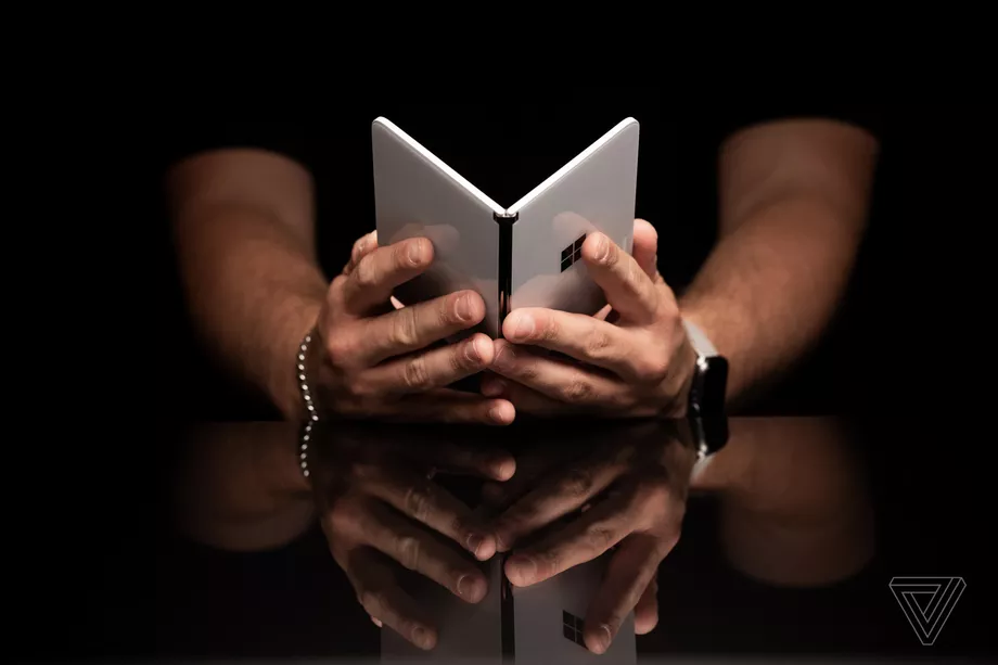
All the right ideas — but spoiled by buggy software and a bad camera Microsoft’sMicrosoft’s Surface Duo aspires to be something different from any other gadget you’ve used. It could be mistaken for a phone or a small tablet, but it’s both less and more than those things. When it’s closed, there are no screens or cameras. In shape and appearance, it’s like a small book, a digital version of the Field Notes notebook I carry around in my back pocket. When open, you get two screens side by side or one screen with the other folded back. And like a notebook, it feels somehow more natural to hold than a phone’s vertical slab shape. You hold it in your hand with the two sides angled toward you like a book.
In truth, there’s nothing the Surface Duo can do that you can’t do on your current smartphone or tablet. Your smartphone surely takes better photos, and your tablet doesn’t have a big gap in the middle of it. But the difference with the Surface Duo is that the way you do things is unique. I found myself tackling tasks that would have frustrated me on those other devices.
Microsoft is charging a starting price of $1,399 for the Surface Duo. Given its capabilities relative to other phones, it is absolutely not worth that price. And even after a couple of weeks, I’m not entirely convinced that the Surface Duo actually makes me more productive than any standard single-screen phone. But even though it doesn’t always get it right, sometimes there’s just a little less mental friction to multitasking on the Duo. I often feel more productive with the Duo. What is that feeling worth?
OUR REVIEW OF MICROSOFT SURFACE DUO
The Microsoft Surface Duo has no screens or cameras on the outside when closed.
SURFACE DUO HARDWARE
TheThe Surface Duo is a lovely, well-designed object. Every millimeter of it has clearly been crafted with intention — though sometimes that intention is so focused that it can lead to annoying compromises. The most important thing to know about the Duo’s hardware is its thickness: 4.8mm when open and 9.9mm when closed. Microsoft’s dedication to thinness is what makes the Duo a pocketable, ergonomic device. It’s also relatively light for a device with two screens and two batteries, at 250 grams.
The thinness and lightness of the Surface Duo are essential to its appeal, as is the fact that Microsoft kept the outside free of screens or camera bumps. Those choices make the thing thin and comfortable to hold, but they also send a signal that this is a different kind of device.
The feel of opening this device like a book — and shutting it like one — is fundamentally different than unlocking a smartphone. It puts you in a different mindset in both cases. The intentionality of the design encourages you to be intentional with your use of the device and to be intentional in not using it.
THE DUO HAS BEEN METICULOUSLY DESIGNED TO FEEL GREAT
The Duo is comfortable to hold.
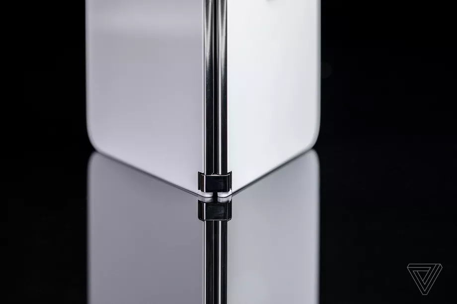
The hinge is very well-engineered.
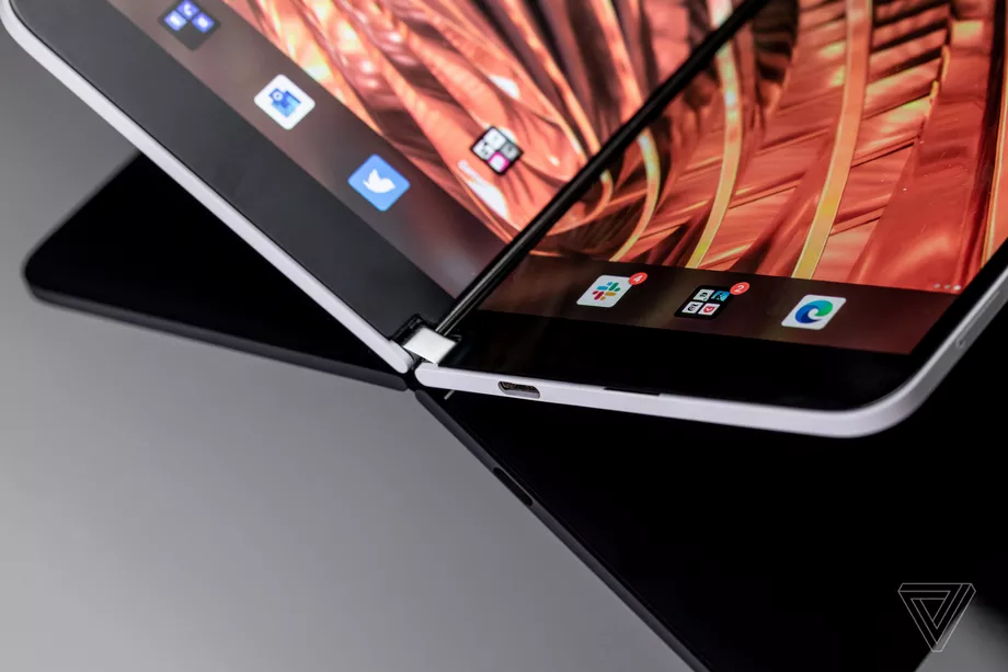
The gap between the screens is small but unavoidable in this design.
The hinge is classic Surface, which is to say it’s meticulously designed to feel great. It rotates a full 360 degrees so you can swing one of the screens around the back and use it like a traditional phone. Or you can angle one side up, and it’ll hold its place while you’re making a video call. It’s firm without being stiff, and all of those tight tolerances minimize the size of the gap between the screens.
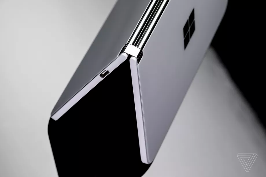
It’s glass on the front and back — both fronts and both backs, I guess I should say. They’re sandwiched around a metal rail. The rail houses the USB-C port but no headphone jack. For once, the argument that the phone is too thin to fit a headphone jack makes sense. It’s also where you’ll find the volume buttons, power button, and fingerprint sensor (which should be integrated into the power button, if you ask me, but it is not).
Not everything is perfect. If I look very closely, I can see a tiny lack of symmetry at the hinge and maybe even the slightest bowing out along the top and bottom. It also ships with plastic bumper rails, which helps with the fairly sharp corners on the edges and also with grip. There’s also a very slight color variation between the two displays on my review unit — the white point on the left-hand side seems a little redder. It’s not something I noticed until reading a Kindle book with the lights turned low.
But the white point isn’t a major complaint about the hardware. I’ll save that for the bezels above and below the dual 5.6-inch OLED screens. They’re big, and I think they’re one of those annoying compromises that were necessary to keep the Duo so thin. As with most bezels, notches, and other screen borders, you get used to them.
Otherwise, they’re good screens. They’re readable in bright light, pixel-dense, and have good viewing angles. If you have a Surface Pen, it will work on this screen, too. They don’t have the high refresh rates that are increasingly standard on $1,000-plus phones, however.
When closed, the Surface Duo is less than 10mm thick.
Those screens are also quite a bit wider than any recent smartphone. Each is designed with a 4:3 aspect ratio, which translates to a device that you can’t use with one hand — even when folded in half. Like the rest of the Duo’s design, I think that width is meant to subtly influence how you think about the device. Your apps look and feel just a tiny bit more like windows on your desktop instead of lists you end up doom scrolling.
Many other things have been sacrificed at the altar of thinness: NFC, wireless charging, a bigger battery, expandable storage, 5G, and perhaps more modern specs like a faster processor and more RAM. There’s only a single speaker, and it’s no great shakes. But all of those things you’d expect on a phone of this price are theoretically expendable because the Surface Duo is theoretically not a phone but something else entirely.
Delivering on that promise falls to the software, which will make or break the whole thing.
Microsoft has heavily customized Android.
MICROSOFT’S ANDROID
MicrosoftMicrosoft may have bitten off more than it can chew with the software on the Surface Duo. The original version it sent out to reviewers was riddled with show-stopping bugs and crashes. A little less than a week ago, the company pushed out a software update — the same one that will land on retail devices today — that solved an appreciable percentage of those bugs.
But some bugs persist. There are hassles with the camera app, with lag and missed inputs, and other oddities like the keyboard jumping into view for no earthly reason. If for no other reason than software stability, it’s worth waiting to see what more people say about their Surface Duo experience over time before considering buying one.
Surprisingly, one of those problems is not the complaint — long-running and richly deserved — that Android tablet apps aren’t good. Because there aren’t many Android tablets, many Android developers rationally choose not to make tablet-optimized versions of their apps, which means there’s no incentive to make Android tablets, and so it goes.
RUNNING TWO APPS ON TWO SCREENS IS OFTEN EASIER THAN TRYING TO SPLIT-SCREEN AN ANDROID TABLET
The app availability problem can turn into a vicious spiral, a problem Microsoft knows all too well from Windows Phone. So one of the cleverest pieces of software design on the Surface Duo is simply what Microsoft chose not to do: make a tablet. Instead, the Duo is exactly what its name suggests: two phone-sized screens meant primarily for running apps side by side.
Just on its own, the ability to easily launch side-by-side apps is great. Without having to learn some whole other interface, you can simply tap on the icon you want on each screen and use them next to each other. That may not seem like something you’re interested in for your phone, but perhaps that’s because it’s been such a pain with a single screen.
One of the things that helps you to be productive on your laptop is windows — the interface with boxes with your apps, I mean, not the OS. Having windows makes it easier to cross-reference stuff and less likely you’ll lose your state when you do another task. And you can move stuff across from one window to another without having to muck about with other interface elements.
But every attempt to replicate that on phones thus far has been kind of crappy. On the Duo, it’s better simply because it’s easy to open up an app on each screen. Microsoft has tried to tout drag and drop between apps, but it’s hard to get that gesture right, and it only works in a handful of apps — so thankfully, tried-and-true copy and paste works just fine.
UNSURPRISINGLY, THE APPS THAT DO BEST NAVIGATING THE GAP ARE MICROSOFT’S
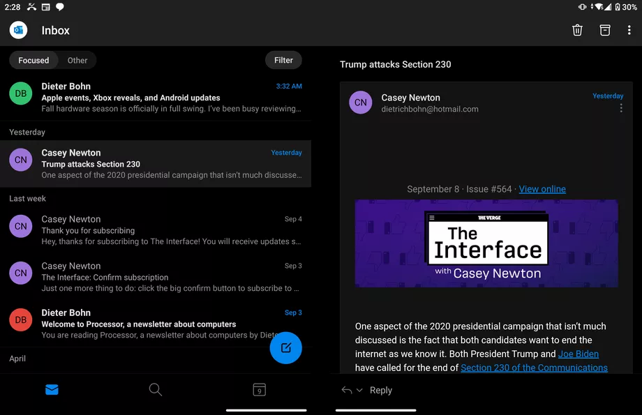
Outlook provides a two-screen view.
When forwarding an email in full-screen view, the original email slides over to give you more room to compose.
The hinge allows you to contort the Duo’s screens into what Microsoft calls “postures.” There’s a tent mode for watching movies, a single screen mode with one of the screens flipped around, a mode with a big keyboard, and a full-screen mode. In full screen, most apps are oblivious to the existence of the gap between screens, and so content either looks goofily split or even gets cut off in that negative space between OLEDs.
The Kindle app is a nice example of turning the gap into an advantage: you get a page on each side and the ability to hold the Duo like it’s a little book. But outside of that, the only apps that handle that gap well are (unsurprisingly) Microsoft’s own. Outlook, in particular, is great: you get your email list on the left side and emails on the right. Hit forward, and the original email scoots over to the left and the entire right screen becomes the compose window for your new email. This means you don’t have to constantly scroll down and up again as you comment point-by-point to an email.
One posture I like: the big keyboard. When you rotate the Duo 90 degrees when there’s an active cursor, the bottom screen automatically turns into a keyboard while the main screen expands to the full view. It lets you see what you’re typing on a larger canvas and gives you a really big keyboard to boot.
But getting apps into their proper place for each of these postures isn’t easy because Android’s natural state is a single phone screen. And that’s where the majority of the bugs really start cropping up.
It’s a shame, too, because those bugs are a result of Microsoft making the right choices when it comes to customizing Android for a true multitasking experience. I don’t think this will be obvious to the casual observer, but after spending a decade reviewing dozens of different flavours of Android, I can say this definitively: Microsoft chose one of the hardest possible roads it could in customizing Android to fit its needs, but it is the right road.
Unlike Samsung, LG, and others who have dabbled in split-screen and folding screen versions of Android, Microsoft has tried to make a multitasking system that doesn’t seem like it’s tacked on top of Android’s more traditional interface.
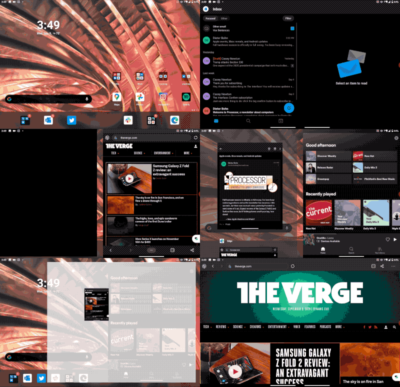
An animation of the Surface Duo’s multitasking. Note this screen recording doesn’t show the gap between screens.
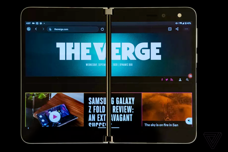
The gap between the two screens when viewing a single webpage across them.
Although a lot of manufacturers are sticking with buttons, modern versions of Android work by swiping up from the bottom to get to the core parts of the OS like multitasking views, the home screen, and your apps. So Microsoft has taken that system and added to it. You can swipe up to get an app window and then drag it around on the two screens to put it in one of those modes.
It’s a noble goal, but remembering what all the swipes do depending on your context is a huge hurdle. Sometimes a swipe brings up multitasking, sometimes it goes home, sometimes it launches the app drawer, sometimes it flings an app to the other screen if you angle it just right (or wrong). Oh, and if you turn the Duo sideways, don’t forget that up is now over on the side.
It’s too much, but it’s a learnable system, and I eventually got proficient in it and even found myself entering that “flow” state that Surface chief Panos Panay likes to talk about. But just as often, I’d enter a rage state as the Duo did something I didn’t expect or lagged out when I was trying to position a window. The real shame of all of this is that Microsoft has achieved the holy grail of every other Android phone maker not named Google: a comprehensive, unified, and coherent ecosystem of apps and services. If you’re in Microsoft’s ecosystem, you will have Outlook, Office, compatibility with Your Phone on Windows 10, OneNote, and OneDrive, all working together in harmony.
This is all miles better than whatever Samsung or LG equivalent you’ll find on their phones. Plus, Microsoft doesn’t force you to use any of it if you don’t want to. Google search is the default instead of Bing, Gmail’s sitting right there, and so on.
Speaking of Google, I am serious when I lay some of these issues at the feet of Android itself. Google has been touting support for foldable for a couple of years now, but it’s been failing to make Android tablets successful for much longer. The result of that technical debt is that Android is woefully unprepared for devices like the Surface Duo and Samsung’s Galaxy Z Fold 2. But at the end of the day, it’s not Google’s logo on the back of the Surface Duo. It’s Microsoft’s.
Through it all, there were still moments of feeling like I could get more done on the Duo than I could on other phones. And as time went on, those moments turned into longer stretches.
The Surface Duo has a single 11-megapixel camera.
SURFACE DUO CAMERA
TheThe Surface Duo’s camera is trash. I should talk to you about its redeeming qualities, like the fact that it has a restrained opinion on color balancing that I appreciate after using Samsung’s overly vivid cameras or the fact that you can dual-screen the camera app to see a roll of your selfies on one side while you take pictures with the other. But I can’t.
CAMERA QUALITY WAS SACRIFICED AT THE ALTAR OF THINNESS
It’s likely that the camera is yet another casualty of Microsoft’s abiding dedication to thinness for the Surface Duo. Perhaps the 11-megapixel sensor is simply the best that could fit into that thin frame. But if the Google Pixel 4A has taught us anything, it’s that good software can work wonders with mediocre hardware.
Instead, the only wonder I experienced is wondering how to get the camera to work in the first place. Since it’s placed on the inside above one of the screens, taking selfies is easy. Launch the camera, take a photo, smile at the results. Heck, Microsoft even has a passable portrait mode in good lighting conditions — well, passable by 2018 standards, anyway.
But if you want to take a photo of somebody else, you have to rotate the other screen so it becomes a viewfinder. But when you try to do that, there’s a 50/50 chance the viewfinder will be on the wrong side. And getting it to the side is a literal exercise in frustration. You have to keep twisting and tapping the Duo until it figures it out. After all that work, the results are muddy, noisy, and in low light, they’re a mess. Plus, they arrive well after you hit the shutter button.
I would berate this camera on a $300 device. The Surface Duo costs $1,400.
Microsoft should have just called this a webcam. It would have set expectations appropriately. Plus, it’s a great webcam! You can position the Duo’s screen right where you want it and take a call without having to hold the phone. And if you’re sneaky, you can play a game of Holedown on the other screen during your Zoom call. Not that I did that. (I did that.)
The Microsoft Surface Duo is surprisingly pocketable.
SURFACE DUO SPECS AND PERFORMANCE
MuchMuch will likely be made of the fact that the Surface Duo has outdated specs. It has last year’s Snapdragon 855 processor and no 5G. I don’t care about any of those things — though, in a couple of years, the lack of 5G may be a minor annoyance. But there’s no denying that the $1,400 price of the Surface Duo certainly isn’t a result of high component costs.
In fact, all of that extra development time with the Snapdragon 855 has yielded some benefits. Microsoft says it was able to heavily optimize its multitasking system in collaboration with Qualcomm, using the 855 as a stable target. I’ll take their word for it that it would have been buggier without that effort.
BATTERY LIFE IS SURPRISINGLY SOLID
A more tangible benefit of that optimization time is battery life: it’s pretty good! That’s absolutely not what I expected when I learned that the two batteries inside the Surface Duo add up to a mere 3,577mAh. That’s a paltry number when compared to the number of pixels it’s being asked to light up, and it’s notably less than what many single-screen Android phones have. Yet, I’m consistently making it to the end of the day on a single charge, and standby time is excellent.
If I have one complaint about the specs it’s that the Duo only has 6GB of RAM That’s plenty for your average Android phone, but it’s not enough to keep apps from closing sooner than I’d like in the background. It’s also not quite enough to reliably run two apps at once without one of them getting a hiccup — and the whole point of the Surface Duo is to run two apps at once.
It’s another instance of the Surface Duo not being a great value — 8, 10, and even 12 gigs is the norm for Android devices that cost over a thousand dollars, much less $1,400. The Pixel 4A has the same amount of RAM as the Duo, and it costs $350.
The Microsoft Surface Duo.
TheThe Surface Duo is trying to be a new kind of device — not a phone, not a tablet, but something in between. That project sounds vaguely familiar, actually. When Steve Jobs introduced the iPad, he set up the stakes for that device:
The question has arisen, lately: is there room for a third category of device in the middle? Something in between the laptop and the smartphone? In order to really create a new category of devices, those devices are going to have to be far better at doing some key tasks.
It’s unlikely that Microsoft has lit upon an iPad-sized market with the Duo. But despite the bugs, I do think it has made a case for itself as a new kind of device — or at the very least, it has earned a chance to keep a spot in the emerging class of devices that try to fit a larger screen in your pocket by folding it in half in some way.
But a better comparison for the Duo isn’t the iPad; it’s the original Surface tablet. When it was first announced, it wasn’t really ready. It had a bunch of very good ideas, but the execution was bad, and a lot of people just didn’t get what Microsoft was going for. But a few years later, Microsoft finally came through with the Surface Pro 3, which actually achieved what the first Surface was trying to do.
MICROSOFT HAS THE RIGHT IDEAS, BUT THE SURFACE DUO IS NOT REALLY READY
This Surface Duo? It’s not really ready. It has a bunch of good ideas, but the execution is bad in places, and a lot of people aren’t going to get what Microsoft is going for. There are more than enough problems here to keep me from recommending it. Maybe if this didn’t cost fourteen hundred bucks we could be having a different conversation. But it does. And if you want to spend that much on a work phone, the Note 20 Ultra does split-screen, comes with a stylus, has a good camera, and runs all of those Microsoft apps just fine.
But like that first Surface, there are more than a few glimmers of vision and potential in the Surface Duo. Microsoft has the clearest, strongest vision for a new direction in mobile computing that I’ve seen this year, but picking a direction and getting to the destination are still two different things.
Microsoft has gotten knocked out of the pocketable device games at least four times before — from WinCE to PocketPC to Windows Mobile to Windows Phone, this company is intimately familiar with failure. But in the Duo, I can see Microsoft learning from all those mistakes, and I’m glad to see the company back in the fight again. I hope that this first Surface Duo isn’t its last round.
Source: Paper.li












Comments