How To Implement Animation Effects In Angular 10
- The Tech Platform

- Oct 4, 2020
- 7 min read
Updated: Jun 12, 2022
In this article, we will discuss how to use the Animation functionalities in Angular 10 applications. Angular provides the functionality to create animation and activate those on the basis of different types of factors.
We can implement animation on any HTML element and also activate those animations on the basis of different events. In this article, we are going to discuss the various animation samples and the different implementations in Angular. Animations in Angular Framework are mainly implemented inside the components using a set of functions (trigger, state, animate, transition, style) with the help of @angular/animations package. Animation styles are mainly used to defined CSS based rules, but they are also defined in TypeScript using the JSON object structure instead of using CSS files. With the help of Angular Animations, we can implement the physical appearance change of any element in an application with the help of different properties in a given time. Animation includes life to HTML elements and represents it as more interactive.
Overview in Angular Animation
Angular Animation (@angular/animations) is one of the most powerful modules in Angular Framework. Angular animations always provide a domain-specific language for defining and designing the web animation sequences for any HTML elements with multiple transformations over time and it can occur sequentially or in parallel. Angular animation always uses the native web animation APIs. The Angular animations are mainly based on the CSS based web transition functionality which means that any HTML objects which be styled or transformed through CSS, that can be also animation the same using the Angular Animations. In this way, it will provide must more control to the developer in designing the animation effects. In Angular Framework, Angular animation mainly used BrowserAnimationModule for animation reasons. So, Angular animation implementations can be divided into 4 steps as below,
Need to evaluate data binding expression which tells Angular about which animation state the main host element is assigned to.
Data binding targets intimate Angular which animation target defines CSS styles for the element state.
Now state intimate Angular which CSS styles should be applied to the element
Finally, Transition instructs Angular how it should apply the specified CSS styles when there is a state change in the application.
Angular animation provides a set of properties through which HTML elements get into motion. It is a very fancy way to display HTML elements on a website or any application. With the help of the Angular framework, we can create animation just similar to CSS animation. Angular animation is built on top of the standard Web Animation API (WAAPI) and can run natively on any browsers which support it. So, in the Angular animations, the style function is one of the most important parts of the animation process. Through this function, we can specify which type of styles need to apply to the target element at a certain state. This function can accept both types of conventions related to defining the style property for an HTML element. It supports the Javascript naming convention for CSS which needs to use camelCase keys.
style({
          backgroundColor: "green",
      })
Also, it supports the CSS property naming convention (dashed case).
style({
 "background-color": "green",
        })
Why need to use Angular Animation?
Now, it is a very common question that Why we need to use Angular Animation in place CSS-based animation? Now, there are many different opinions against this question. In some scenario, CSS based animation is much better compared to the Angular Animation and vice – versa. Angular always provides simplicity in comparison with CSS while performing complex type animations on a single HTML element at various states or events. The browser normally uses the GPU layers to process the animations so that the CPU can work on the main task. The Browser takes advantage of GPU speed boost by creating a GPU layer for that element when a change in a 3D characteristic like translate3d() or matrix3d() triggers the Browser.
How to use Angular Animation?
Now, in this section, we will discuss how to use Angular Animation in any application. So, to use the @angular/animations in our application, we need to follow the below steps,
First, we need to verify that the @angular/animations package is installed and listed as a dependency in our package.json file. Normally, it is added by default when we create any new project using Angular CLI.
If it is not added in the package.json file, then need to install by running the command npm install @angular/animations.
Now open the angular module file and import the BrowserAnimationModule within the defined angular module.
import { BrowserModule } from '@angular/platform-browser';
import { NgModule } from '@angular/core';
import { FormsModule } from '@angular/forms';
import { HttpClientModule } from '@angular/common/http';
import { BrowserAnimationsModule } from '@angular/platform-browser/animations'

import { AppRoutingModule} from './app-routing.module';
import { AppComponent } from './app.component';

import { HomeComponent } from './home/home.component';

@NgModule({
  declarations: [
    AppComponent, HomeComponent,

  ],
  imports: [
    BrowserModule,
    AppRoutingModule,
    BrowserAnimationsModule,
    FormsModule,
    HttpClientModule
  ],
  providers: [],
  bootstrap: [AppComponent]
})
export class AppModule { }
Concept of Animation States & Transition between State Change
Now, in this section, we will discuss some basic sample use cases related to the Angular Animation module. So, before start demonstrating those examples, first we need to understand the basic working mechanism of Angular animation and its related states. Animation States Angular provides us the facility to define a style and transition which need to be applied when an elements state changes. Angular always provides 3 different states which we can implement in our animation code –
Wildcard (*) This is the default state of the element. It indicates all states of the element. Say for example, * => active means that a state can be changed to an active state from any state or vice-versa.
Void (void) This state is used when we create the element but that particular element is not a part of the DOM or the element is already removed from the DOM part.
Custom It can be any custom name to indicate a certain state of the element like ‘active’, ‘inactive’, ‘basic’, etc.
Transitions Between State Change So, before we start the angular animation, we always need to define the different states for the HTML element to perform state change between different transitions. It is the first parameter that needs to be passed into the state function. We also need to define the style within this parameter so that it can be applied to the HTML element for that mentioned state. Now, for animating the transition between different state, we need to pass the transition function by mentioning the two states (i.e. from state and target state) in which transition need to be applied.
import { trigger, state, style, animate, transition } from '@angular/animations';

@Component({
    selector: 'animation-demo',
    template: `
          <div class="mybox mx-auto" [@enabledStateChange]="enabledStateChange"></div>
          <div class="msgbox mx-auto">{{msg}}</div>
      `,
  animations: [
    trigger('enabledStateChange', [
      state( 'default', style({
            opacity: 1,
        })
    ),
    state( 'disabled', style({
            opacity: 0.5,
        })
      ),
      transition('* => *', animate('300ms ease-out')),
    ])
  ]
})
Now, in the below section, we briefly discuss the different parameters of the animation method,
trigger – This parameter accepts a name for the animation trigger and also an array of state and transition methods to implement the configuration for the animation.
state – This parameter always accepts the name related to the state and the styles which should be applied when the HTML element is in a specified state.
style – This parameter is used to define the CSS styles which need to be applied to the HTML element.
transition – This parameter mentioned the configuration for the transitioning between the different states and their direction.
animate – This parameter specifies the duration of the animation and any additional CSS animation properties such as easing.
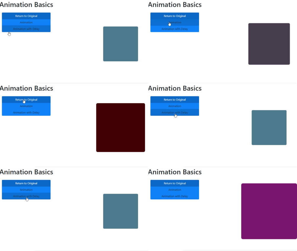
Demo 1 - Basic Animation Sample Now, in this demo, we will demonstrate the basic animation sample against the event. In this sample, we create a basic rectangle shape objects using the CSS property. Now when clicked the Animation button, it will perform some basic animation with the help of background color & also scaling the objects in the certain mention ration. Also, we will use the delay property of the CSS to show the animation properly. For this purpose, we need to create the below-mentioned component in our project, basic.animation.component.html
<h1>Animation Basics</h1>

<div class="container-fluid">
    <div class="row">
        <div class="col-2">
            <div class="btn-group-vertical btn-block" style="margin-top:1rem;">
                <a (click)="changeState('original')" class="btn btn-primary active">Return to Original</a>
                <a (click)="changeState('basic')" class="btn btn-primary">Animation</a>
                <a (click)="changeState('delaying')" class="btn btn-primary">Animation with Delay</a>
            </div>
        </div>
        <div class="col-5">
            <demo-animation [currentState]="switchState"></demo-animation>
        </div>
        <div class="col-5"></div>
    </div>
</div>
basic.animation.component.ts
import { Component } from '@angular/core';

@Component({
  selector: 'basic-animation',
  templateUrl: './basic.animation.component.html'
})

export class BasicAnimationComponent {

 public switchState:string='original';

 public changeState(state:string):void{
 this.switchState = state;
    console.log(this.switchState);
  }
}
demo.animation.component.ts
import { Component, Input } from '@angular/core';
import { trigger, state, style, animate, transition, keyframes, group } from '@angular/animations';

@Component({
  selector: 'demo-animation',
  template: `
        <div class="mybox mx-auto" [@changeState]="currentState" ></div>
    `,
  styles :[`
    .mybox {
        background-color : #47748f;
        width : 200px;
        height : 200px;
        border-radius : 6px;
        margin : 6rem
    }
    .msgbox {
        margin: 2rem;
        padding-top:2rem;
        font-size: 1.8rem;
        text-align: center;
    }
  `],
  animations: [
    trigger('changeState', [
        state('original', style({
            backgroundColor: '#47748f',
            transform: 'scale(1)'
        })),
        state('basic', style({
            backgroundColor: '#440000',
            transform: 'scale(1.4)'
        })),
        state('delaying', style({
            backgroundColor: '#812170',
            transform: 'scale(1.6)'
        })),
        transition('* => basic', animate('800ms')),
        transition('* => original', animate('200ms')),
        transition('* => delaying', animate('800ms 2000ms ease-out'))
    ])]
})

export class DemoAnimationComponent {
    @Input() currentState : string;
}
Now, include these components in the app.module.ts file and then execute in the application.
Demo 2 - Animation Against Mouse Events
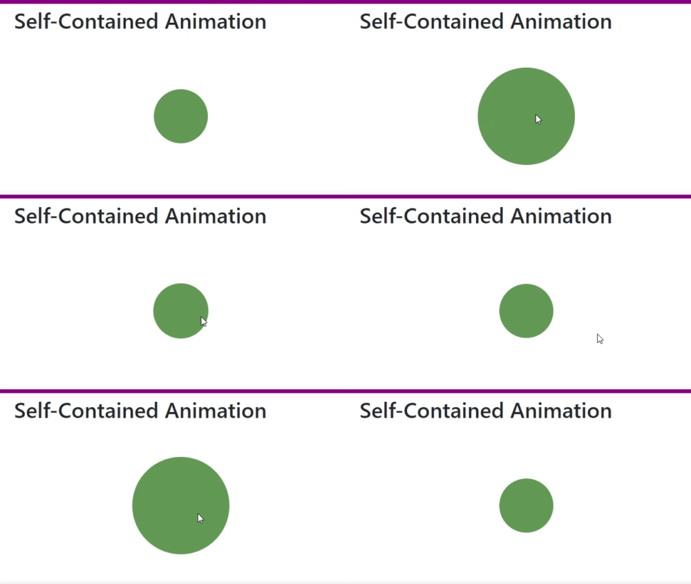
Now in this demo, we will demonstrate animation against the mouse event like mouse-down or mouse-leave events. For this purpose, we need to create the below components, container.animation.component.html
<h1>Self-Contained Animation</h1>

<div class="container-fluid">
    <div class="row">
        <div class="col-4">
            <mouse-animation></mouse-animation>
        </div>
    </div>
</div>
container.animation.component.ts
import { Component } from '@angular/core';

@Component({
  selector: 'container-animation',
  templateUrl: './container.animation.component.html'
})

export class ContainerAnimationComponent {

}
mouse.animation.component.ts
import { Component } from '@angular/core';
import { trigger, state, style, animate, transition } from '@angular/animations';

@Component({
  selector: 'mouse-animation',
  template: `
        <div class="mymouse mx-auto" (mouseenter)="changeMouseState('hover')" (mousedown)="changeMouseState('press')"
            (mouseleave)="changeMouseState('rest')" [@changeState]="currentState"></div>
    `,
  styles: [`
    .mymouse {
        background-color: #5c8f52;
        width: 100px;
        height: 100px;
        border-radius: 200px;
        margin: 6rem;
    }
  `],
  animations: [
    trigger('changeState', [
        state('rest', style({
            transform: 'scale(1)'
        })),
        state('hover',   style({
            transform: 'scale(1.8)'
        })),
        state('press',   style({
            transform: 'scale(3.0)',
            backgroundColor: '#8f5a7a'
        })),
        transition('rest => hover', animate('400ms ease-in')),
        transition('hover => rest', animate('200ms ease-out')),
        transition('hover => press', animate('400ms ease-in')),
        transition('press => rest', animate('200ms ease-out'))
    ])

]
})

export class MouseAnimationComponent {
    currentState:string = "rest";

    changeMouseState(state:string) :void {
 this.currentState = state;
    }

}
Now, include the above-mentioned component in the app.module.ts file and then execute the program in the browse,
Concept of Router Animation
Animations in Route transition is one of the coolest ways to add some life to the web application. Route Animation always indicates to the animations which are applied to view transitions during a route change. As per the Angular guideline, this needs to be done by defining a nested animation sequence in the top-level component that hosts the view and also the component which hosts the embedded views. In this way, we can apply nested router-outlets in our application. For the animation trigger, we just need to apply that against the div which contains the router-outlet. To demonstrate this, we need to first wrap the router-outlet within a div element which will contain the trigger for the animation. After this, we need to assign an attribute directive in the router-outlet which contains the data about the active routes and needs to define their states which are then used to implement an animation state value to the animation trigger based on the configuration.
<div class="page" [@routerAnimations]="prepareRouteTransition(outlet)">
      <router-outlet #outlet="outlet"></router-outlet>
</div>
Now, we need to pass the outlet’s current state to our routeAnimations with the help of the router-outlet’s activedRoute property. This property will always be updated whenever any route navigation occurred and at the same time, it will trigger the animation.
public prepareRouteTransition(outlet) : any {
 const animation = outlet.activatedRouteData['animation'] || {};
 return animation['value'] || null;
  }
We can also pass the additional parameters through the router's data property if we need to implement variable animations.
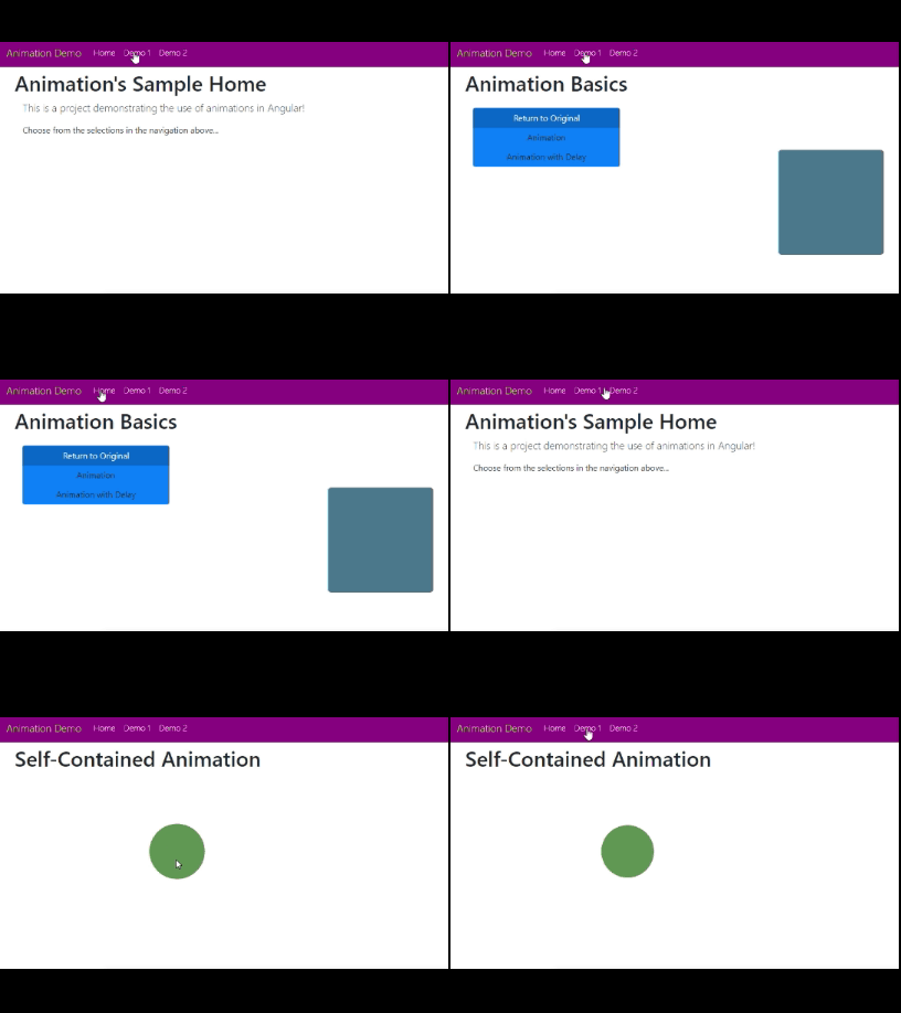
Demo 3 - Router Animation
Now, in this demo, we will demonstrate the route animation. For that purpose, we need to add the routing module to our module. We will use the route navigation key against the Demo1 and Demo2 examples. For that purpose, we need to add the below component code – app-routing.module.ts
import { NgModule } from '@angular/core';
import { Routes, RouterModule } from '@angular/router';

import { HomeComponent } from './home/home.component';
import { BasicAnimationComponent } from './01-basic-animations/basic.animation.component';
import { ContainerAnimationComponent } from './02-container-animations/container.animation.component';

const routeData: Routes = [
    { path: '', redirectTo:'/home', pathMatch: 'full', data: {animation: { value: 'home',}} },
    { path: 'home', component: HomeComponent, data: {animation: { value: 'home',}} },
    { path: 'basic-animation', component: BasicAnimationComponent, data: {animation: { value: 'basic',}}  },
    { path: 'container-animation', component: ContainerAnimationComponent, data: {animation: { value: 'container',}}  }
];

@NgModule({
  imports: [RouterModule.forRoot(routeData)],
  exports: [RouterModule]
})
export class AppRoutingModule { }
app.component.ts
import { Component, ViewEncapsulation } from '@angular/core';
import { trigger, transition } from '@angular/animations';
import { slideAnimation } from './shared/animation';

@Component({
  selector: 'app-root',
  templateUrl: './app.component.html',
  styleUrls: ['./app.component.css'],
  encapsulation: ViewEncapsulation.None,
    animations: [
        trigger('routerAnimations', [
            transition('* => *', slideAnimation)
        ])
    ]
})

export class AppComponent {
  title = 'angular-animation-demo';

 public prepareRouteTransition(outlet) : any {
 const animation = outlet.activatedRouteData['animation'] || {};
 return animation['value'] || null;
  }

}
app.component.html
<nav class="navbar navbar-expand-lg fixed-top navbar-inverse mb-4" style="background-color:#920787;">
    <button class="navbar-toggler navbar-toggler-right" type="button" data-toggle="collapse" data-target="#navbarSupportedContent" aria-controls="navbarSupportedContent"
            aria-expanded="false" aria-label="Toggle navigation">
      <span class="navbar-toggler-icon"></span>
    </button>
    <a class="navbar-brand" href="#" style="color: rgb(169, 235, 16);font-weight: 300;">Animation Demo</a>

    <div class="collapse navbar-collapse" id="navbarSupportedContent">
      <ul class="navbar-nav mr-auto">
        <li class="nav-item">
            <a class="nav-link" routerLink="/home" routerLinkActive="active" style="color: white;">Home</a>
        </li>
        <li  class="nav-item"><a class="nav-link" routerLink="/basic-animation" routerLinkActive="active" style="color: white;">Demo 1</a></li>
        <li  class="nav-item"><a class="nav-link" routerLink="/container-animation" routerLinkActive="active" style="color: white;">Demo 2</a></li>

      </ul>
    </div>
</nav>
<div class="page" style="padding-top: 30px;">
    <div class="page" [@routerAnimations]="prepareRouteTransition(outlet)">
      <router-outlet #outlet="outlet"></router-outlet>
  </div>
</div>
animation.ts (for mentioned the common route style related effects)
import { animate, animation, style } from '@angular/animations';

export var slideAnimation = animation([
    style({ opacity: 0, position: 'absolute', left: 0, right: 0, transform: 'translate3d(-100%,0,0)' }),
    animate('400ms ease-in-out', style({ opacity: 1, transform: 'translate3d(0%,0,0)' })),
])
Now, execute the program and check the output in browse,
Conclusion
In this article, we discussed how to implement the animations using the Angular Framework in any web application. Also, we discussed the basic concept of animation along with transition states, route animation, etc. I hope, this article will help you. Any feedback or query related to this article is most welcome.
Source: paper.li - Debasis Saha


Comments