How to Create Graph in Excel?
- The Tech Platform

- Jun 20, 2022
- 4 min read

A graph is a visual element that represents data in a worksheet. You will be able to analyze the data more efficiently by looking at a graph in Excel rather than numbers in a dataset. Excel covers a wide range of graphs that you can use to represent your data.
Consider the below Excel Data:

Consider the Type of graph you want to make..
1. Bar Chart
A bar graph shows information about two or more groups. Bar graphs are mainly used to make comparisons across a range.
Advantages:
summarize a large dataset in visual form; easily compare two or three data sets;
better clarify trends than do tables;
estimate key values at a glance.
Disadvantages:
require additional written or verbal explanation;
can be easily manipulated to give false impressions.

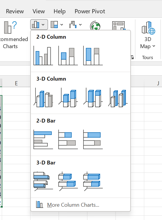
Example of 2-D Column Bar Chart

2. Line Graph
A line graph is formed by connecting a series of values/data points using straight lines. A line graph can be used when you want to check whether the values are increasing or decreasing over some time.
Advantages:
show trends and relationships between data better than other graphs;
compare trends in different groups of a variable;
clearly show error values in the data;
Usually simple to read and understand
Disadvantages:
multiple lines on the graph, especially unrelated can be confusing;
difficult to make out exact values for data

Example of 2-D Line Chart with Markers

3. Pie Graph
A pie chart is a circular graph representing data in the form of a pie/circle. It is divided into different sections, each one representing a proportion of the whole.
Advantages:
provides an excellent visual concept of a whole;
clear comparison of different components, highlight information by visual separation of a segment, easy to label, lots of space.
Disadvantages:
hard to compare two data sets; the total represented by the chart is unknown;
difficult to understand without labels (especially with similarly sized segments)
Example of 2-D Pie Chart

4. Scatter Plot
A scatter plot, also called a coordinate graph, uses dots to represent the data values for two different variables, one on each axis. This graph is used to find a pattern/ relationship between two sets of data.
Advantages:
Clearly indicates data correlation (illustrates positive, negative, strong, weak relationships);
method of illustration non-linear patterns;
shows spread of data, outliers;
clearly demonstrate atypical relationships;
used for data extrapolation and interpolation
Disadvantages:
impossible to label data points, hard to find out exact values;
error bars and too many data points can quickly make graph unreadable;
cannot show relationship between more than two variables at once

Example of Scatter Plot

5. Area Chart
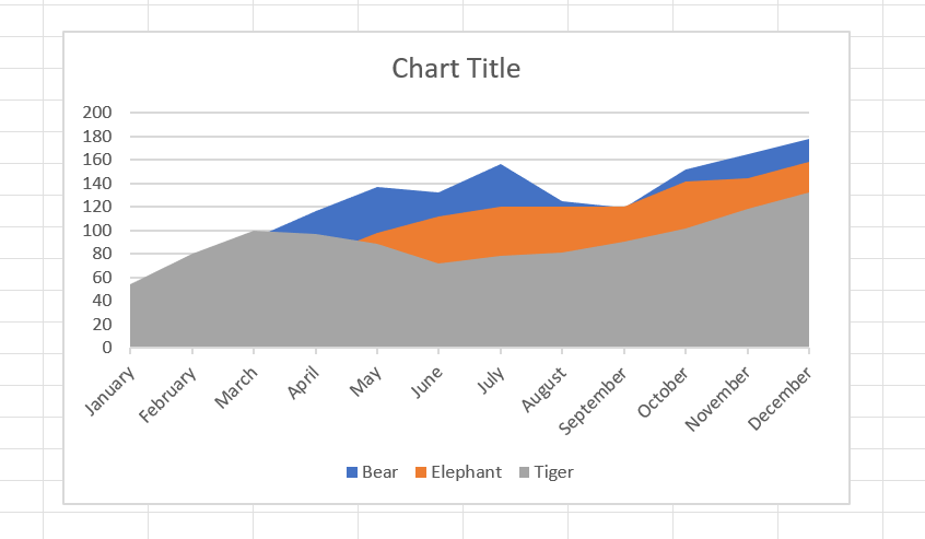
An area chart depicts the change of two or more data points over time. They are similar to the line charts, except the area charts are filled with color below the line. This chart is useful to visualize the area of various series relative to each other.
Advantages
A helpful tool for comparing two or more quantities.
Data is simple to follow and understand.
Great for showing trends over time and analyzing the statistics.
Disadvantages
Following and understanding the trends is easy, but exact values can not be compared.
Ineffective when comparing large groups of data. The data plots are overlapped, and it becomes difficult to make out where they end or start.


Properties of Excel Charts
1. Switch Row/Column
If you want to display the animals (instead of the months) on the horizontal axis, execute the following steps.
1. Select the chart.
2. On the Chart Design tab => Switch Row/Column.
Result:


2. Legend Position
To move the legend to the right side of the chart, execute the following steps.
1. Select the chart.
2. Click the + button on the right side of the chart, click the arrow next to Legend and click Right.
Result:

3. Data Labels
You can use data labels to focus your readers' attention on a single data series or data point.
1. Select the chart.
2. Click the + button on the right side of the chart and click the check box next to Data Labels.
or click on Chart Design => Add Chart Element => Data Labels => select the option.
Result:

Example of Data labels => Data Callout

4. Chart Style/Chart Color
You can use the chart style to make your chart more presentable and good.
1. Select the Chart
2. Click on + button on the right side of chart, click on which chart style you want.
3. You can also change the color of your chart.
Result:

Chart Color

Advantages of using Charts in Excel
Visualization
Excel charts allow spreadsheet administrators to create visualizations of data sets. By highlighting a set of data within an Excel spreadsheet and feeding it into the charting tool, users can create various types of charts in which the data is displayed in a graphical way. This can aid understanding of a data set, as well as communication of it, with Excel charts suitable for use within management or corporate presentations. A chart can create a clearer picture of a set of data values than a table with rows of numbers in it, allowing managers to incorporate this understanding into analysis and future planning.
Automation
The Excel application automates the process of generating charts from existing data sets. If a spreadsheet already contains updated data, the chart function can transform this data into a chart with a minimal amount of user input. The Recommended Charts tool in Excel is a key part of this process. Using the chart function, spreadsheet administrators can generate a chart in a few clicks, choosing a chart type, as well as options such as labels, axes and titles.
Customization
The chart function in Excel enables users to strike a balance between automation and customization. Although the program can generate a chart quickly and easily, the user is also able to assert control over many chart details if necessary. As well as customizing the data presented within a chart, users can finely tweak the chart options to any detail. Charts in Excel can also be altered after they have been initially generated, by selecting a chart and choosing from the available options to amend the chart type, data or other details.
Integration
If a business or other organization is using spreadsheet data managed within Excel, using the chart function within Excel aids integration of the data. For example, when an Excel spreadsheet generates a chart from the data within a worksheet, the chart will automatically update whenever the data itself is edited. This allows business managers and administrators to manage their data and visualizations within a single application, with the results updating instantly.
The Tech Platform


Comments