
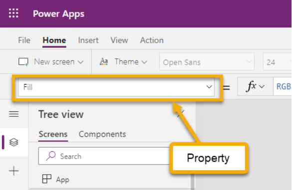
Fill Property
- The Tech Platform

- Feb 9, 2021
- 4 min read
Click on the below link to read the fill property in details

Configure the style of a control based on how the user interacts with it.
You can specify colors in many ways:
Color enumeration: Specify color names from cascading style sheets, as in these examples:
1. Color.Red
2. Color.Indigo
ColorValue function: Specify text strings such as color names from cascading style sheets and hex-code notation (#), as in these examples:
1. ColorValue( "AliceBlue" )
2. ColorValue( "#ff00ff" )
ColorFade function: Specify how faded a color is, from fully black (-100%) to fully white (100%), as in this example:
1. ColorFade( Color.Red, 50% )
RGBA function: Specify the red, green, and blue components of a color from 0 to 255, and specify an alpha channel from 0% (fully transparent) to 100% (fully opaque), as in this example:
1. RGBA( 255, 0, 255, 25% )
Color properties can also reference other color properties. For example, Label.PressedColor may be set to the formula Label1.Color, automatically cascading a change from one property to another.
Normal
These properties are in effect normally, when the user is not interacting with the control.
1. BorderColor – The color of a control's border.
Applies to Add picture, Audio, Button, Camera, Card, Check box, Column chart, Date Picker, Display form, Drop down, Edit form, Export, Gallery, HTML text, Image, Import, Label, Line chart, List Box, Microphone, PDF viewer, Pen input, Pie chart, Radio, Rating, Slider, Text input, Timer, Toggle, and Video controls.
2. BorderStyle – Whether a control's border is Solid, Dashed, Dotted, or None.
Applies to Add picture, Audio, Button, Camera, Card, Check box, Column chart, Date Picker, Display form, Drop down, Edit form, Export, Gallery, HTML text, Image, Import, Label, Line chart, List Box, Microphone, PDF viewer, Pen input, Pie chart, Radio, Rating, Slider, Text input, Timer, Toggle, and Video controls.
3. BorderThickness – The thickness of a control's border.
Applies to Add picture, Audio, Button, Camera, Card, Check box, Column chart, Date Picker, Display form, Drop down, Edit form, Export, Gallery, HTML text, Image, Import, Label, Line chart, List Box, Microphone, PDF viewer, Pen input, Pie chart, Radio, Rating, Slider, Text input, Timer, Toggle, and Video controls.
4. Color – The color of text in a control.
Applies to Add picture, Button, Check box, Column chart, Date Picker, Drop down, Export, HTML text, Import, Label, Line chart, List Box, Microphone, Pen input, Pie chart, Radio, Text input, and Timer controls.
5. Fill – The background color of a control.
Applies to Add picture, Audio, Button, Card, Check box, Date Picker, Display form, Drop down, Edit form, Export, Gallery, HTML text, Icon, Image, Import, Label, List Box, Microphone, PDF viewer, Pen input, Radio, Rating, Screen, Shape, Text input, Timer, Toggle, and Video controls.
Focused
These properties are in effect when the control is focused.
1. FocusedBorderColor – The color of a control's border when it has focus.
2. FocusedBorderThickness – The thickness of a control's border when it has focus.
These properties apply to Add picture, Attachments, Audio, Button, Camera, Check box, Combo box, Date Picker, Drop down, Export, Gallery, Icon, Image, Import, Label, List Box, Microphone, Radio, Rating, Shape, Slider, Text input, Timer, Toggle, and Video controls.
Disabled
These properties are in effect when the control is disabled. A control can be disabled if the Disabled property is set to true.
1. DisabledBorderColor – The color of a control's border if the control's DisplayMode property is set to Disabled.
Applies to Add picture, Button, Check box, Column chart, Date Picker, Drop down, Export, HTML text, Image, Import, Label, Line chart, List Box, Microphone, PDF viewer, Pie chart, Radio, Slider, Text input, Timer, and Toggle controls.
2. DisabledColor – The color of text in a control if its DisplayMode property is set to Disabled.
Applies to Add picture, Button, Check box, Date Picker, Drop down, Export, Import, Label, List Box, Microphone, Radio, Text input, and Timer controls.
3. DisabledFill – The background color of a control if its DisplayMode property is set to Disabled.
Applies to Add picture, Button, Check box, Date Picker, Drop down, Export, HTML text, Image, Import, Label, List Box, Microphone, Radio, Text input, and Timer controls.
Hover
These properties are in effect when the user hovers over the control with a mouse.
1. HoverBorderColor – The color of a control's border when the user keeps the mouse pointer on that control.
Applies to Add picture, Button, Check box, Column chart, Drop down, Export, HTML text, Image, Import, Label, Line chart, List Box, Microphone, PDF viewer, Pie chart, Slider, Text input, Timer, and Toggle controls.
2. HoverColor – The color of the text in a control when the user keeps the mouse pointer on it.
Applies to Add picture, Button, Check box, Drop down, Export, Import, Label, List Box, Microphone, Radio, Text input, and Timer controls.
3. HoverFill – The background color of a control when the user keeps the mouse pointer on it.
Applies to Add picture, Button, Check box, Drop down, Export, Icon, Image, Import, Label, List Box, Microphone, Radio, Shape, Text input, and Timer controls.
Pressed
These properties are in effect when a button or image control is pressed.
1. PressedBorderColor – The color of a control's border when the user taps or clicks that control.
Applies to Add picture, Button, Check box, Column chart, Drop down, Export, Icon, Image, Import, Label, Line chart, List Box, Microphone, PDF viewer, Pie chart, Shape, Slider, Text input, Timer, and Toggle controls.
2. PressedColor – The color of text in a control when the user taps or clicks that control.
Applies to Add picture, Button, Check box, Drop down, Export, Import, Label, List Box, Microphone, Radio, Text input, and Timer controls.
3. PressedFill – The background color of a control when the user taps or clicks that control.
Applies to Add picture, Button, Check box, Drop down, Export, Image, Import, Label, List Box, Microphone, Radio, Text input, and Timer controls.
Selection
These properties are in effect when the user selects an item in a control.
1. SelectionColor – The text color of a selected item or items in a list or the color of the selection tool in a pen control.
2.SelectionFill – The background color of a selected item or items in a list or a selected area of a pen control.


Comments