
Customizing SharePoint Framework Web Part Properties - Part Three
- Nakkeeran Natarajan

- Apr 29, 2019
- 3 min read
Updated: Apr 30, 2019
Introduction
In this article, you will learn how to manage multiple pages on the SharePoint Framework web part "Properties" pane. You will also see different fields or properties getting appended to the Properties pane.
In my previous articles, I have introduced the custom properties and explained check box field properties sample on SharePoint Framework (SPFx) web part.
In my SPFx article series, you can learn about SPFx introduction, prerequisites, steps for setting up the environment, and developing and testing the web parts using the local environments.
In the previous article sample, you will have seen descriptions and check box fields added to the properties pane on a single page. Here you can see them separated on multiple pages. I will be using the samples from the previous article.
In this sample, the web part property pane contains two pages.
The first page contains the text and label fields.
The second page contains the check box fields.
Components
propertyPaneSettings method holds the basic pane structure where it defines the basic definition for the web part properties. Basically, in the property definition file, pane page contains the following components.
Header Contains the description property about the page.
Groups Multiple groups with each group having multiple properties.
Group Contains the group name and the properties. The properties can be anything like label, description, check box, drop down, etc.
Pages
In the first page of property pane, let us show two groups.
The first group contains a set of text field properties.
The second group contains the label property, which shows the static text.
In the second page of property pane, let us define one group.
The group contains the check box fields.
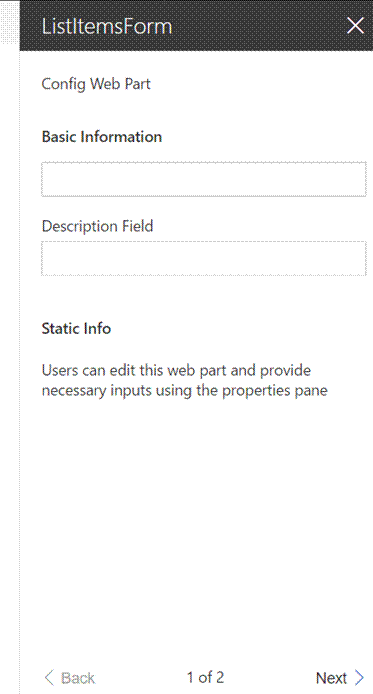
The below structure shows the first page of the properties pane which has a header and groups attached with multiple properties. At the bottom of the screen, you can see the pagination option.

Implementation
Let us look at the implementation. The property pane method which needs to be included in the web part file is shown below. It shows two pages with necessary headers and groups. The group contains the properties.
protected get propertyPaneSettings(): IPropertyPaneSettings {
return {
pages: [ {
header: {
description: strings.PropertyPaneDescription,
},
groups: [ {
groupName: strings.BasicInfo,
groupFields: [
PropertyPaneTextField('title', {
label: strings.TitleFieldLabel
}),
PropertyPaneTextField('description', {
label: strings.DescriptionFieldLabel
})
]
},
{
groupName: "Static Info",
groupFields:
[
PropertyPaneLabel('About', {
text:'Users can edit this web part and provide necessary inputs using the properties pane'
})
]
}
]
},
{
header: {
description: strings.PropertyPaneDescription
},
groups: [ {
groupName: "Optional Fields",
groupFields: [
PropertyPaneCheckbox('checkboxProperty1',{
isChecked:false,
isEnabled:true,
text: this.checkboxProperty1
}),
PropertyPaneCheckbox('checkboxProperty2',{
isChecked:false,
isEnabled:true,
text: this.checkboxProperty2
})
]
}
]
}
]
};
}
The custom implementation or logic is included in the custom methods of web part file.
IListItemsFormWebPartProps.ts file
The properties are defined using IListItemsFormWebPartProps.ts file.
export interface IListItemsFormWebPartProps {
description: string;
checkboxProperty1: string;
checkboxProperty2: string;
}
mystrings.d.ts File
declare interface IListItemsFormStrings {
BasicGroupName: string;
DescriptionFieldLabel: string;
TitleFieldLabel: string;
BasicInfo: string;
}
declare module 'listItemsFormStrings' {
const strings: IListItemsFormStrings;
export = strings;
}
en-us.js File
define([], function() { return { "PropertyPaneDescription": "Config Web Part", "BasicGroupName": "Group Name", "DescriptionFieldLabel": "Description Field", "BasicInfo": "Basic Information" } });
ListItemsForm.module.scss File
The necessary style content is present inside ListItemsForm.module.scss file. Refer to my previous article.
ListItemsFormWebPart.ts File
The ListItemsFormWebPart.ts file contains the implementation part.
import {
BaseClientSideWebPart,
IPropertyPaneSettings,
IWebPartContext,
PropertyPaneTextField,
PropertyPaneCheckbox,
PropertyPaneLabel }
from '@microsoft/sp-client-preview';
import styles from './ListItemsForm.module.scss';
import * as strings from 'listItemsFormStrings';
import { IListItemsFormWebPartProps } from './IListItemsFormWebPartProps';
export interface spListItems{
value: spListItem[] }
export interface spListItem{
Title: string; id: string; Created: string; Author: {
Title: string;
};
}
export default class ListItemsFormWebPart
extends BaseClientSideWebPart<IListItemsFormWebPartProps> {
private listName: string = "";
private checkboxProperty1: string = "Created";
private checkboxProperty2: string = "Author";
public constructor(context: IWebPartContext) {
super(context); }
public render(): void {
// Render the items in tabular format
this.domElement.innerHTML = <div class="${styles.listItemsForm}">
<div class="${styles.Table}">
<div class="${styles.Heading}">
<div class="${styles.Cell}">Title</div>
</div>
</div>
</div>`;
this.listName = "TestList";
this.LoadData(); }
private LoadData(): void{
let url: string = this.context.pageContext.web.absoluteUrl + "/_api/web/lists/getbytitle('"+this.listName+"')/items?$select=Title";
// If Created Time check box option is selected
if(this.properties.checkboxProperty1){
url += ",Created";
// Column header for Created Time field
this.domElement.querySelector("."+styles.Heading).innerHTML +=`<div class="${styles.Cell}">Created</div>`;
}
// If Author check box option is selected
if(this.properties.checkboxProperty2)
{
url += ",Author/Title&$expand=Author";
// Column header for Author field
this.domElement.querySelector("."+styles.Heading).innerHTML +=`<div class="${styles.Cell}">Author</div>`;
}
this.GetListData(url).then((response)=>{
// Render the data in the web part
this.RenderListData(response.value);
});
}
private GetListData(url: string): Promise<spListItems>{
// Retrieves data from SP list
return this.context.httpClient.get(url).then((response: Response)=>{
return response.json();
});
}
private RenderListData(listItems: spListItem[]): void{
let itemsHtml: string = "";
// Displays the values in table rows
listItems.forEach((listItem: spListItem)=>
{
let itemTimeStr: string = listItem.Created;
let itemTime: Date = new Date(itemTimeStr);
itemsHtml += `<div class="${styles.Row}">`;
itemsHtml += `<div class="${styles.Cell}">
<p>${listItem.Title}</p></div>`;
if(this.properties.checkboxProperty1)
{
itemsHtml += `<div class="${styles.Cell}"><p>${listItem.Created}</p></div>`;
}
if(this.properties.checkboxProperty2){
itemsHtml += `<div class="${styles.Cell}">
<p>${listItem.Author.Title}</p></div>`;
}
itemsHtml += `</div>`;
});
this.domElement.querySelector("."+styles.Table).innerHTML +=itemsHtml; }
protected get propertyPaneSettings(): IPropertyPaneSettings {
return {
pages: [ {
header: {
description: strings.PropertyPaneDescription,
},
groups: [ {
groupName: strings.BasicInfo,
groupFields: [
PropertyPaneTextField('title', {
label: strings.TitleFieldLabel
}),
PropertyPaneTextField('description', {
label: strings.DescriptionFieldLabel
})
]
},
{
groupName: "Static Info",
groupFields:
[
PropertyPaneLabel('About', {
text:'Users can edit this web part and provide necessary inputs using the properties pane'
}) ]
}
] }, {
header: {
description: strings.PropertyPaneDescription
},
groups: [ {
groupName: "Optional Fields",
groupFields: [
PropertyPaneCheckbox('checkboxProperty1',
{
isChecked:false,
isEnabled:true,
text: this.checkboxProperty1
}),
PropertyPaneCheckbox('checkboxProperty2',
{
isChecked:false,
isEnabled:true,
text: this.checkboxProperty2
})
]
}
]
}
]
};
}
}
Note
The web part needs to be deployed to the site and added to the page. In my previous article, you can see the steps for deployment.
Screenshots
The following screenshot shows the web part page with first page of the web part property pane.


The following screenshot shows the web part page with second page of the web part property pane.
Summary
Thus, you have learned how to manage multiple pages on the SharePoint Framework web part Properties pane with different fields or properties.
What Next? In the next article, you will learn about working with adding other custom properties that are available to the properties pane.


Comments