
Create Power BI Visual Using R Script Visual - Bar Chart
- Dhruvin Shah

- Mar 21, 2019
- 3 min read
Overview
Power BI provides the flexibility to create your own custom visuals using R script visual. Before you dive in I request you to refer the following articles to start with R-script visuals.
In this article, we will learn a step-by-step procedure to create R-script visual in Power BI.
I believe you have installed R Engine and R Studio in your environment. You must have an active Power BI Pro license to publish R script visual. If you have Power BI free license, you are not able to publish the R script visual.
I have uploaded Sample data file and report file in GitHub. You can directly download it using the following URL,
Now, let’s get started!
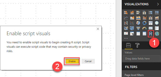
Click on R-script visual from the visualization pane. It will open a pop up for “Enable script visuals”. Click on Enable button.

It will create a blank R-script visual as shown in the following figure.

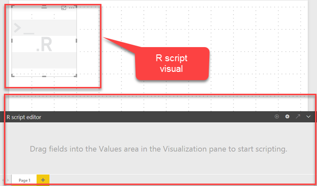
Drag the fields, from the table. In our example, we want to prepare a report using Month, US and London column. So, I drag three columns.
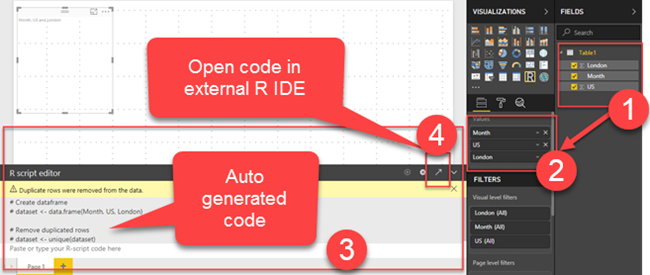
If you observe, it has created some auto-generated code in the script editor. Now, we will open the same code in R Studio.
To open the code in R studio, click on the icon (Edit script in external R IDE).

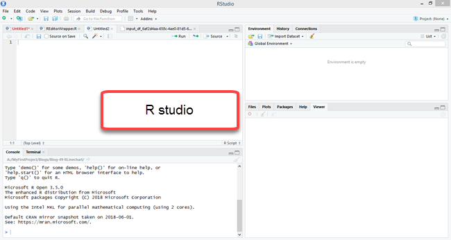
It will open R Studio with predefined code.
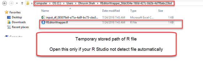
Optional If your Power BI code doesn’t reflect in R Studio automatically, then you need to go to the following path to open your R script file in R Studio.
Path: C:\Users\Dhruvin Shah\REditorWrapper_58dc934e-160d-427c-8d2b-4d7f8abc23bd
Here, REditorWrapper folder with the latest timestamp covers your R file. Open it in R Studio.

Follow the below step only if your R file does not open in R Studio automatically.
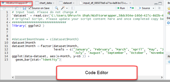
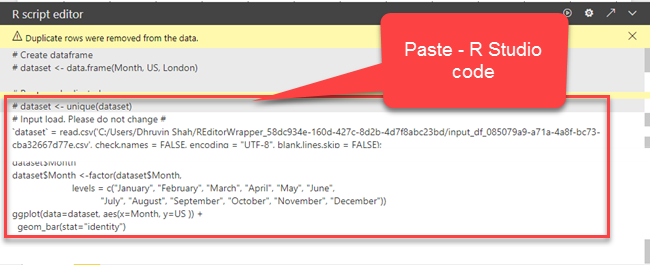
Now, let’s add code in R Studio and check the result.
Add following line of code in R Studio.
library( ggplot2 )
$monthname = c(dataset$Month) dataset$Month
dataset$Month <-factor(dataset$Month,
levels = c("January", "February", "March", "April", "May", "June", "July", "August", "September",
"October", "November", "December"))
ggplot(data=dataset, aes(x=Month, y=US )) +
geom_bar(stat="identity")

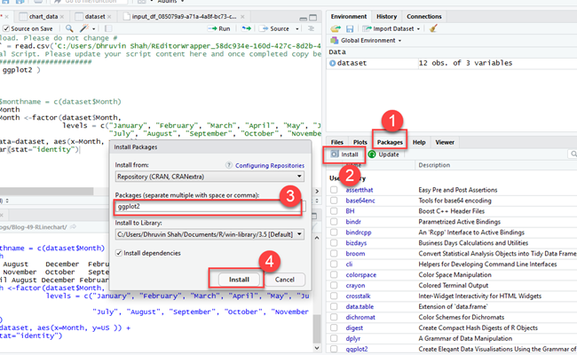
Here, we are using a ggplot2 library to generate the R visual. So you need to install it first.
To install ggplot2 package open packages from R studio, click on install, search for ggplot2 and click on Install.

Once this library is installed, we will run the code we have applied in Step 5.
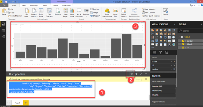
To run the code, select all the code first ( Refer numeral 1 from Figure below) and click on run button. ( Refer numeral 2 from Figure below). Select the Plot tab ( Refer numeral 3 from Figure below) to see the final result. (Refer numeral 4 from Figure below)

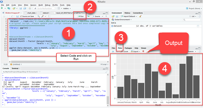
You will find the end result in the plots option of R studio. (Refer numeral 4 from Figure above)
Now, we will copy the same code from R Studio and paste it to Power BI R script visual.

Select code and click on Run button. ( Refer numeral 1 and 2 from Figure below ) The visual will look like the following image. (Refer numeral 3 from the following Figure).

Now, let’s publish the report to your Power BI Pro account. R script visual will not work with Power BI free license.
Conclusion:
This is how you can start the custom development with R script visual in Power BI. I hope you love this article. Stay connected with me for amazing tutorials.


Comments